Last July, I wrote a blog post announcing the public release of the Rockefeller Archive Center’s Documentation Website as a platform for storing and sharing our institution’s documentation. Now, a little more than a year later, I am writing a new post to update our colleagues at the RAC and in the wider archives field about the work we have completed following the success of our efforts to make more content available. I will reflect on our motivations, approach, and processes for redesigning the site in order to enable improved discovery and access.
Rather than announcing the release of a live, revamped Documentation Site, this blog entry serves as an introduction to another post I will soon publish about our team’s experiences with incorporating usability testing into the design and development of an interface we expect to soon share with the public. During the summer, we conducted a series of usability tests as a way to evaluate the impact and effectiveness of the changes we have staged on the development version of the site. I want to explain our decisions for why and how we redesigned the site in order to provide context about the version of the platform our test participants assessed as well as provide insight into our rationale and methodology for carrying out the tests. We look forward to demonstrating how our test participants’ assessments enhanced our design when we launch the new Docs Site!
One Year Later and a Lot More Content
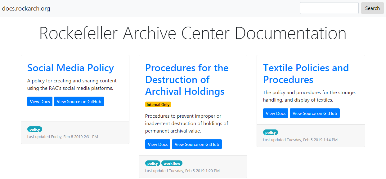
Due to our coworkers’ exceptional enthusiasm and hard work in the months following the release of the Documentation Site, there are now 20 pieces of documentation available to RAC staff on the platform’s development site. In addition to the Markdown training workshop discussed in the last post, Katie Martin organized and facilitated a version control workshop in order to help our coworkers become more comfortable using GitHub to add and edit documentation content for the platform. Nine staff members attended this training session where they practiced some of the activities necessary to manage Markdown files in the GitHub documentation repositories. Hannah Sistrunk further empowered our colleagues to manage documentation on the site by writing and updating a Documentation Site Content Approval Policy and a Documentation Site Guide to Managing Content. We thank our colleagues at the Archive Center for embracing opportunities to learn new technical skills and for embracing the Docs Site as a means for storing, revising, and disseminating the documentation they create and maintain in order to effectively execute their job responsibilities. Their continued support ensures that the platform remains a useful resource for locating and accessing our institution’s policies and workflows. Below is an image of the current public facing Docs Site.
We are excited to see the scope of the Docs Site’s holdings expand with each new addition, yet shortly after much of the content was migrated to the platform, our team started to wonder if the site’s design facilitated effective access to a larger number of documentation items. No sense of organization was applied to how the documentation was uploaded to the site’s homepage, and users had to scroll through all of the site’s content in order to discover the piece of documentation they wanted. Furthermore, we felt that the homepage design looked too busy. The cards that we created to provide access to the individual documentation items appeared cluttered. Although this issue was not noticeable when the site only hosted a few pieces of documentation, it became significantly more apparent when the number of documentation cards on the homepage increased. We worried that users would be distracted by the excessive text and colors on the cards and miss key information that would assist them in finding the content they wanted.
We decided that the amount of content added to the site necessitated a redesign of the homepage in order so that we could resolve the aforementioned issues. Our approach to rethinking the organization, appearance, and functionality of our homepage came to revolve around four main objectives:
- Applying some type of organization to the documentation items
- Implementing functionality for more effective discovery of documentation
- Revising the documentation cards to only display key information and create a cleaner aesthetic
- Identifying and resolving accessibility issues in the site’s interface in order to ensure equitable access to the site’s content
New Face, New Functionality
Below is an image of our completed redesign for the Docs Site homepage. This is the version of the site that our usability test participants assessed this summer.
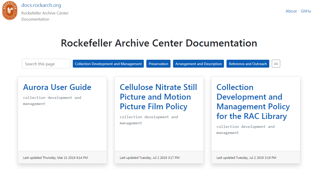
In terms of ordering the documentation on the homepage, we believed that implementing an alphabetical organization of the documentation titles would start us on the right path to finding a solution. Alphabetizing the documentation would provide a uniform system of arrangement that the site’s users could quickly discern. It could even facilitate easier access for users familiar with the documentation items’ titles.
We also wanted to supply an additional layer of organization over the documentation that may not affect the way that the items appear when a user initially lands on the site but that could be utilized to enable a more refined search of the site’s content. We analyzed the different pieces of documentation on the site in order to determine how they could be grouped together and sought to incorporate the opinions of our coworkers because of their investment in the use and creation of those items. The image below shows the results of a card sorting activity we had our colleagues perform at a monthly archives staff meeting.
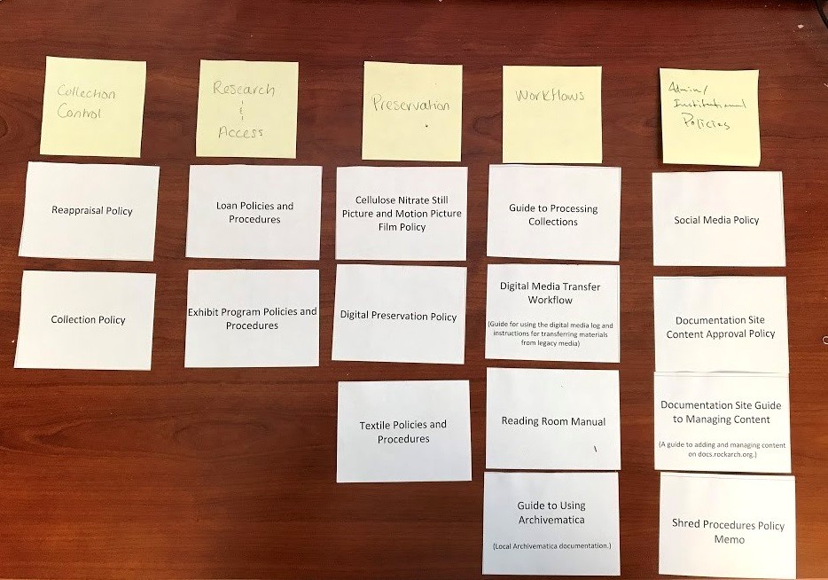
Using the procedures of a card sort activity, we asked our coworkers to organize all of the documentation items into categories. Our analysis of the results of the activity revealed that our colleagues devised their categories based around two primary means of organization: 1) the archival functions, practices, and procedures the documentation supported; and 2) whether the documentation was a policy or a workflow. Although we sought to accommodate both forms of organization throughout much of our redesign project, we eventually decided to keep only the function-based categories because we had developed the means to utilize them for expedited content discovery.
We inserted a group of buttons into the site’s homepage that could be used to filter the documentation items according to four function-based categories: Collection Development and Management; Preservation; Arrangement and Description; and Reference and Outreach. We complemented the buttons with a search box that could provide additional filtering functionality. Users could type into the search box, and the site would refine what documentation items appeared on the homepage based upon how the inputted text matched the text in the items’ titles and category names.
In addition to noting the inclusion of the filter buttons on the homepage, you may also see that we removed the search box that was located in the site’s header. We believed that two different search boxes with two different purposes on the homepage would confuse users, so we moved the original search box which facilitates a keyword search across all of the documentation on the platform to the webpages used for the individual documentation items. Using Jekyll includes and layouts, we coded the search box so it would appear at the top of the table of contents for each documentation item page.
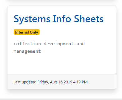
The picture I included of the homepage redesign also shows the cleaner aesthetic of the documentation item cards that we strived to achieve. We gutted the cards of information and features that we believed redundant and unhelpful to our users. For example, we eliminated the buttons that linked to the documentation as well as the brief text descriptions about the documentation. The functions supported by both data elements were already performed by the documentation titles which link to the corresponding documentation pages and describe the contents of the documentation. We also replaced the buttons that linked to the individual documentation GitHub repositories with a single GitHub link in the site’s header. Unsure to what degree most of our users sought to access or utilize the Markdown files in the GitHub repositories, we believed that supplying a link to our institution’s GitHub organization page would give sufficient enough access to those users interested in exploring the different repositories.
Aside from the documentation titles, the only components that remain on the cards consist of the last updated date information, the internal only tags, and the category labels.The last updated date information and the internal only tags still serve two of our original aims for the platform. They respectively support version control over our documentation and restrict access to documentation we cannot share with the public. We added the category labels in order to facilitate transparency in regards to what information the filter buttons utilize to refine the documentation on the homepage.
When we first finished revising the documentation cards, we worried that the streamlined design made them appear too flat. We then added a shadowing element to make the cards pop better on the homepage.
Finally, we worked to make our site more accessible for all potential users by launching an accessibility audit of the platform. Utilizing Google Chrome browser applications like aXe Browser Extension, WAVE Evaluation Tool, and Siteimprove Accessibility Checker, we observed that most of the site’s accessibility issues concerned missing and inaccurate HTML elements.
When developing the site, we usually depend on what we can look at in our browsers for verifying if we have properly set up a piece of code. The relief in seeing an element of the site’s structure or functionality finally work after hours and even days of struggling can make us forget to check the parts of our code that may not interfere with how we can use or access the site but may limit how accessible the site is across different groups of users. Screen readers and other forms of assistive technology rely on the correct use and identification of HTML elements in web pages for effective navigation. In order to ensure that users can utilize these tools to access the Docs Site, we reviewed the HTML sectioning elements we had taken for granted. We had to add some elements to our code such as ‘main’ for the primary contents of our site’s pages and change other elements that were inaccurate. ARIA landmark roles and labels were also coded into the site in order to better convey the site’s structure to assistive technologies.
In addition to identifying the site’s structural elements, we created a greater contrast between the different colors on the site in order to help users with visual impairments distinguish text. We purposefully made the blue colors on the platform darker so that users could better differentiate those elements from the white ones.
The redesign we developed for the Documentation Site took several months to complete, and it submerged us deeper into the challenges and headaches of web development than we had experienced when we coded the first version of the platform. We were excited to finish this phase of the project and eager to learn how people outside of our team would respond to the changes we have made.
What’s Next
As stated at the beginning of this post, my next blog entry will discuss the series of usability tests we conducted this summer in order to effectively elicit, evaluate, and utilize user response to the redesigned site. Although the Docs Site will continue to have the same public interface as it did last July when this post is published, I wanted to describe our approach and motivations for redesigning the platform because they established the criteria by which we sought to assess the impact and effectiveness of the changes we have made. Please return soon to learn how the data we gathered through the usability tests will impact the appearance, organization, and functionality of the Documentation Site that the public will soon see!
If interested in learning more about the processes we employed for planning and executing the redesign of the Documentation Site as well as earlier parts of the RAC Documentation Site Project, check out these slides from a presentation Katie and I gave this past May at the Best Practices Exchange Conference.