I’ve recently pushed out a pretty major change to the search results page in DIMES, inspired by direct feedback from users as well as analysis of web analytics and server logs, so I wanted to post a detailed account of both what I did as well as why I did it.
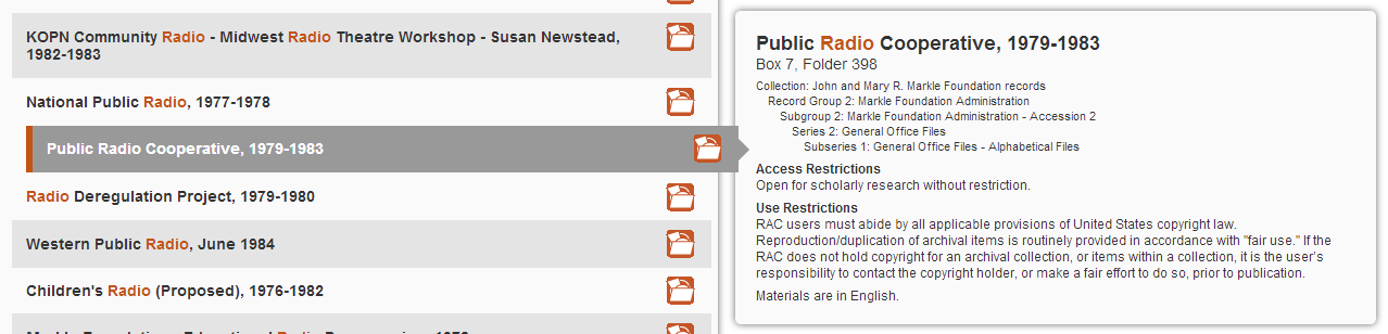
Here’s a screenshot of what the search results page looked like before I made any changes: 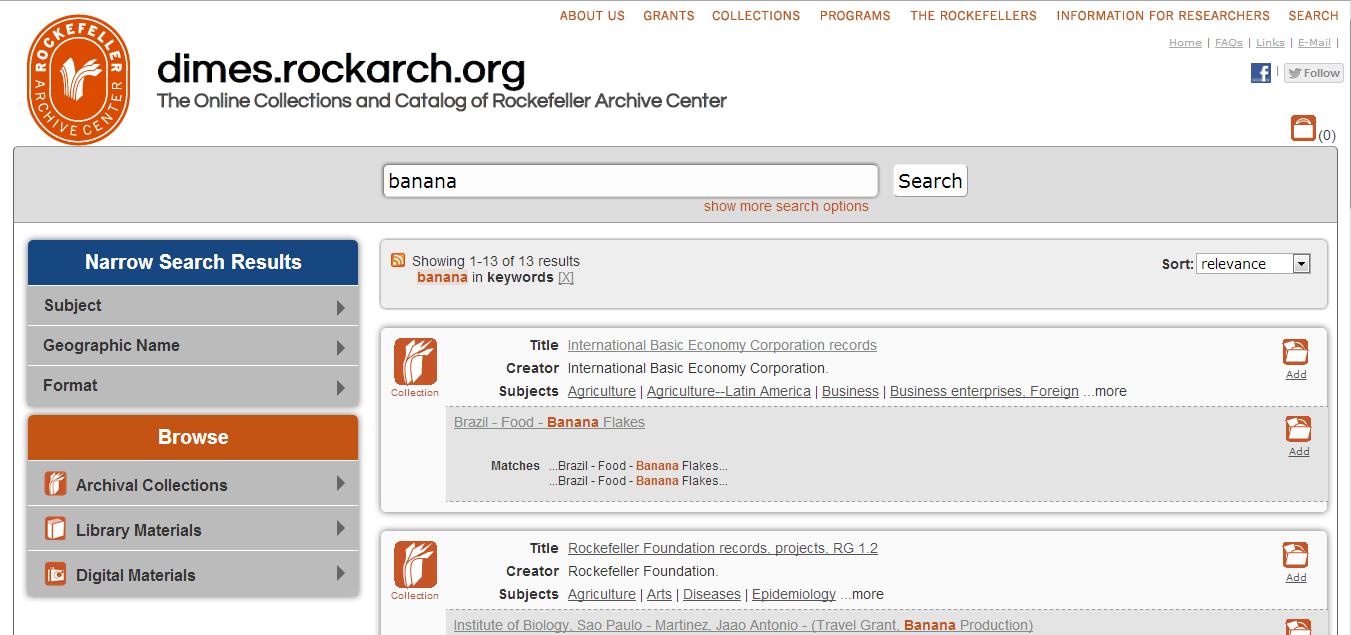
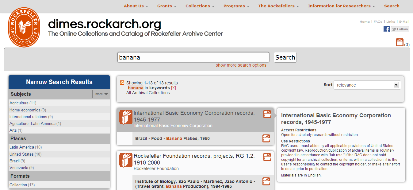
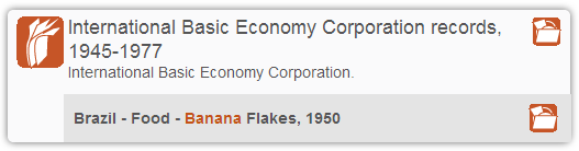
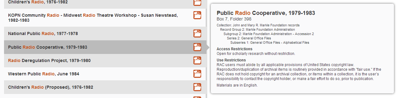
And here’s a screenshot of the same search after the changes:
There were a few things I knew going in. First of all, the system was too slow, and users were getting frustrated with long load times and slow responses. Second, I could tell from server logs and anecdotal evidence that many users were “pogo-sticking” back and forth between the search results page and finding aids. When I asked users why they were doing that, they told me they were looking for information they could not find in the search results page, including restrictions, detailed description of the result, and the location of a result within the hierarchy of a collection. In addition to this “pogo-sticking” being an inefficient search pattern for users, it also put a heavy load on the system, causing it to slow down even more, which in turn caused even more user frustration. Lastly, the appearance and behavior of facets - particularly the way in which the system reloaded the page when showing or hiding values within a particular group - was confusing to researchers.
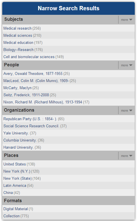
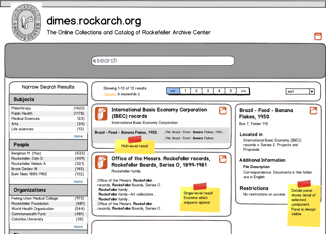
I started out by tackling the facets, changing both the way in which they were grouped (breaking people and organizations into separate facets), and also replacing jargon-y terms (Geographic Name, Subject Name) with simpler, more intuitive names (Places, People). More importantly, instead of having the facets totally collapsed by default, I displayed the five most popular values within each facet, which vastly improved the “information scent” the interface provides to researchers. I also changed the functionality of the facets so that showing and hiding the full list of terms in a particular facet no longer required reloading the page.
Most of the work that I did, however, was focused on the main results content. As you’ll notice from the “before” screenshot, each result contained a fair amount of information. However, each result (and the page as a whole) lacked a clear visual hierarchy, which made it difficult for researchers to easily parse the information presented to them.
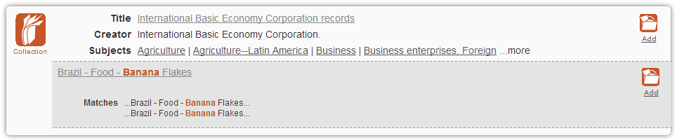
Using web analytics data, I began by stripping out information and functionality from the interface that was not used; the subjects and “Find similar items” functionality were seldom clicked on and were consequently the first things to go. In addition, I removed all of the labels for information and instead created a clear visual hierarchy to help users understand the display. As I discovered when testing, the removal of these labels coupled with an improved visual hierarchy helped to unclutter the interface, which allowed users to understand the information presented to them much more easily.
Once I’d done that, I realized that there was a lot of wasted space on the page; it was not necessary for each result to extend all the way across the screen. I did some whiteboard brainstorming and came up with a couple of ideas
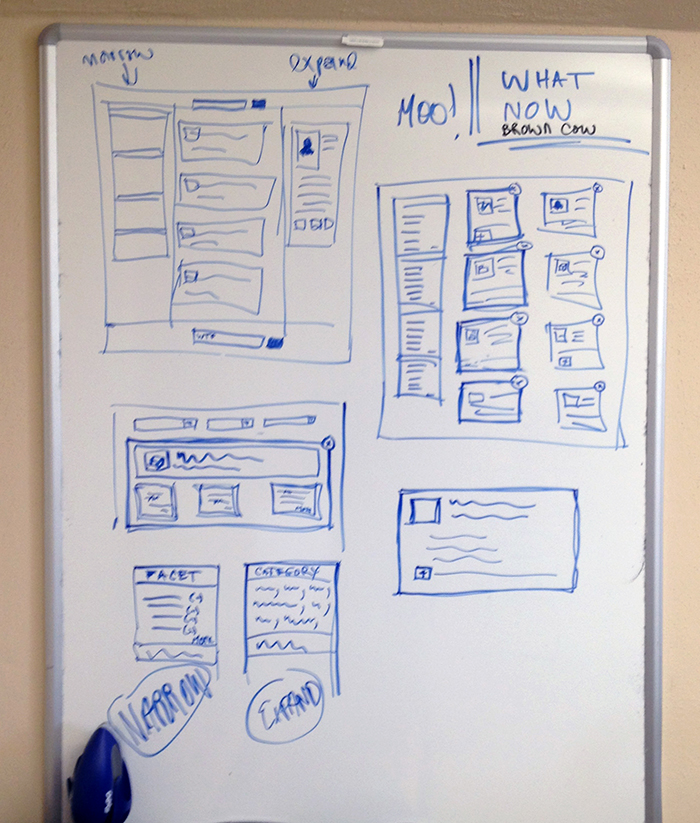
I then turned those into more detailed mockups. The concept that quickly rose to the top from this exercise was a three-column layout which made better use of the horizontal space on the screen to display a details panel for one result at a time. This details panel would contain some of the information that users clearly felt was missing from the display: access restrictions, scope and content notes at the component level, and the location of the component in the collection hierarchy.
My first try at prototyping this required users to click on a component to see the details panel, and then click on the title in that details panel to go to the finding aid. However, it was quickly apparent that users found this behavior a bit counterintuitive.
Consequently, I changed things around a bit so that the details panel would show when researchers hovered over a result, and that if they clicked on the title of that result they’d be taken to the finding aid.
Lastly, I also made some changes to the amount of information the system loads when going to a finding aid from a search result. Previously, the system tried to load the entire container list when users clicked on a hit. This resulted in a lot of extra data being loaded (and often loaded over and over) putting an unnecessary load on the system. Through testing, I discovered that users did not want or need to see the entire container list when they clicked on a search result. Instead, they wanted to see some of the folders surrounding the hit they got, in case there were other folders they might want to see. Now, the system loads only the components at the same hierarchical level as the hit: for example, if a hit is located in Series 1, Subseries A of a collection, the system will only load Subseries A. This is much faster, and a quick look at server logs shows that the system is handling requests much faster and more efficiently.