As you’ve probably noticed, we recently rolled out a pretty major overhaul to DIMES. This post describes the changes that were made in some detail and also describes the reasons behind the changes.
Digital Objects
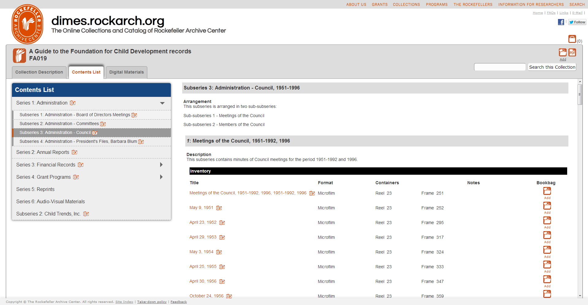
Perhaps the most significant change to the system is the addition of functionality to view digitized material from within a finding aid. Right now, the only collection for which we have digitized material online is the Foundation for Child Development, but we’ll be working on adding material from more collections in the coming months.
It’s important to note that the PDFs you see online are access copies of high-resolution TIFFs that are stored in and managed by Archivematica. We’ve been working with Artefactual over the past few months to come up with a way that Archivematica can connect to the Archivists’ Toolkit database to insert metadata about these access copies and link them to the correct components in a resource record. You can read more about this process in previous blog posts.
In DIMES, you’ll now see that series and subseries in which there are digital objects have a little camera icon next to their name. In the container lists, you’ll see these same icons, and will also notice that titles of folders with digitized content are now linked. If you click on one of those folder titles, you’ll be able to see the digitized material from that folder.
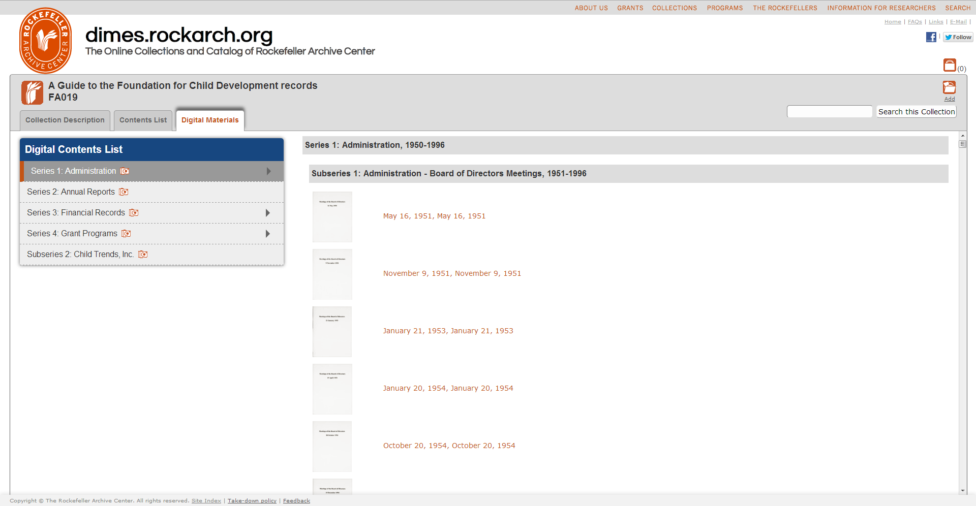
 We’ve also added a “Digital Materials” tab, which shows you all of the digitized content in the collection. Right now this might not seem so useful, but as we digitize material selectively rather than digitizing an entire collection (like we did with the RF Centennial project), this tab will be a quick way to access all of the available digital material in a collection.
Usability
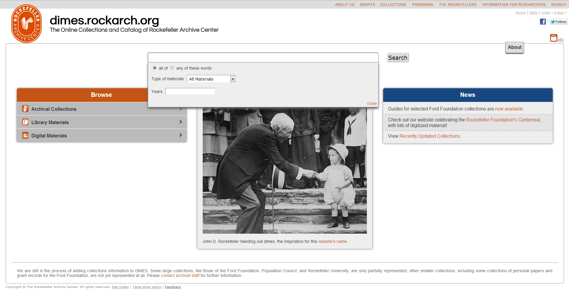
As I was working on adding digital object functionality, I became increasingly unhappy with our existing home page. It was visually boring yet cluttered; there was a lot of text and almost no visual elements.
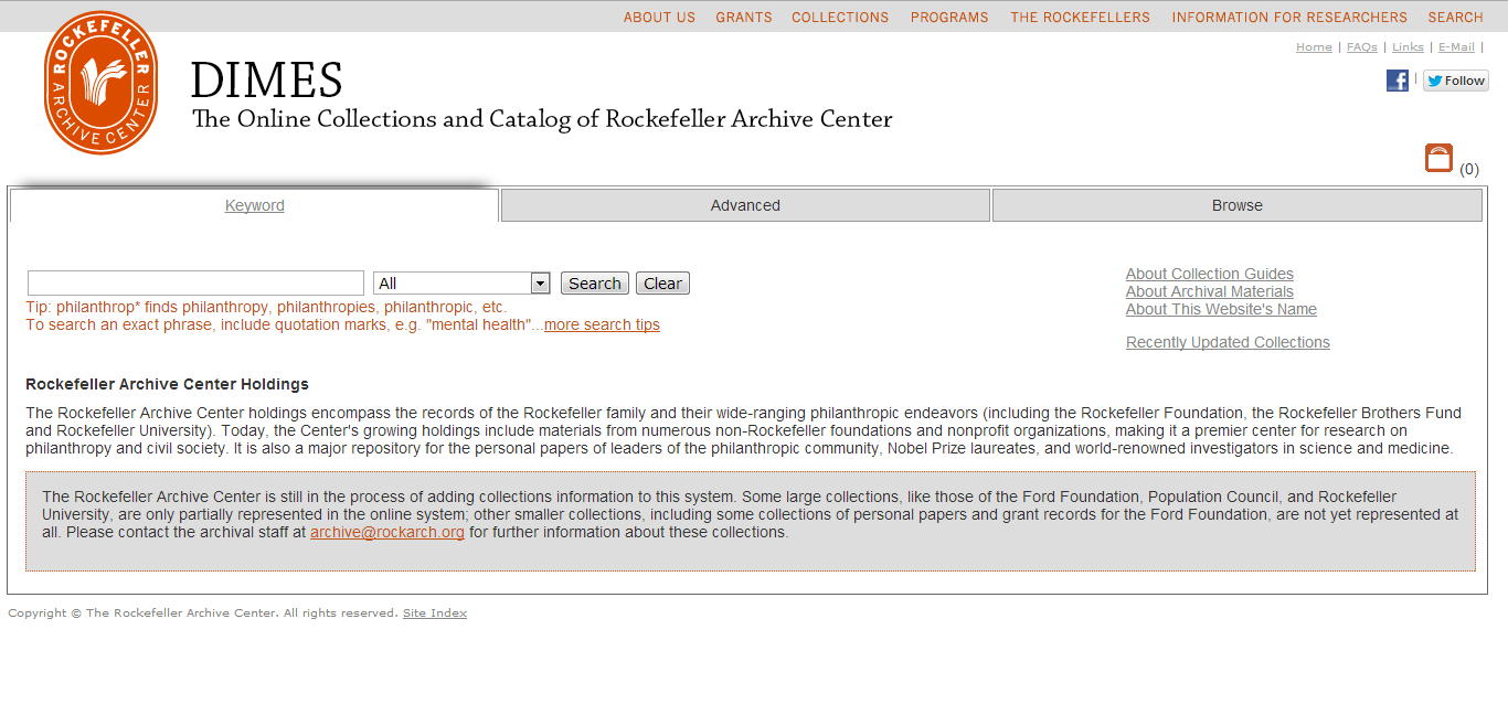 In addition, as I was monitoring analytics for the site, I noticed that very few people clicked on the “Advanced” search tab, and that almost none of those who did actually performed a search from that page. This led me to believe that very few users noticed the advanced search tab, and the minority that did notice it did not think it was worth using. Usability testing confirmed these suspicions, and revealed that many users expected to see an interface with many options for incredibly fine-grained searching.
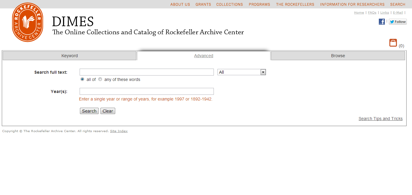 In response to this feedback, I moved all of the advanced search functions from their original tab to a box that slides out from underneath the main keyword search on the home page. Once I’d done that, it seemed like I could easily move the browse tab to the main page as well, which I did by adding an accordion menu that shows one set of options at a time. The end result is that there’s only one home page, which has three times the functionality of the previous home page but is much more visually appealing and less cluttered.
 Once I’d made those changes the home page, the page that displayed search results started to bug me. It was cluttered, disorganized and confusing.
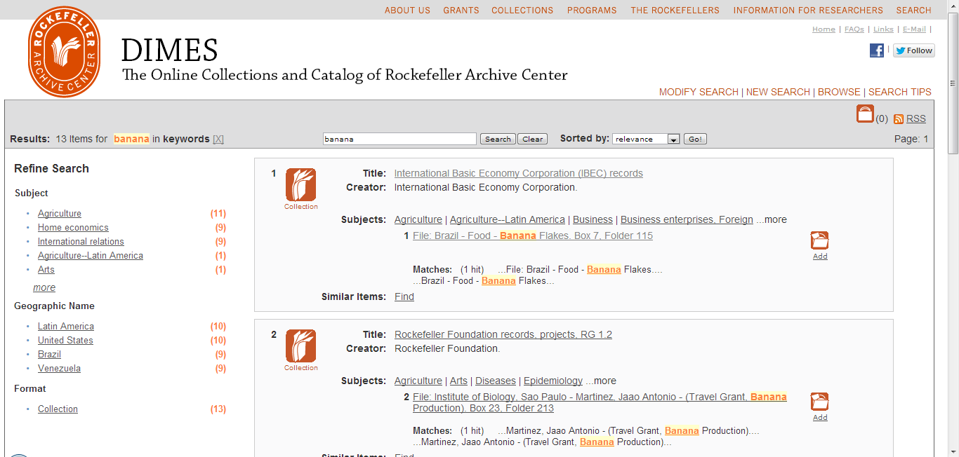 I started out by eliminating the hit numbers attached to the collections and collection components, which were a constant source of confusion to almost everyone who used the system. Then I moved the information about the search query, the total number of hits for that query, and the way in which those results were sorted out of the header bar (where they were often missed) right above the results themselves. I also did some styling to visually distinguish between a collection and a folder, improve consistency in colors, and to make the appearance and behavior of the facets complementary to the appearance and behavior of the browse box.
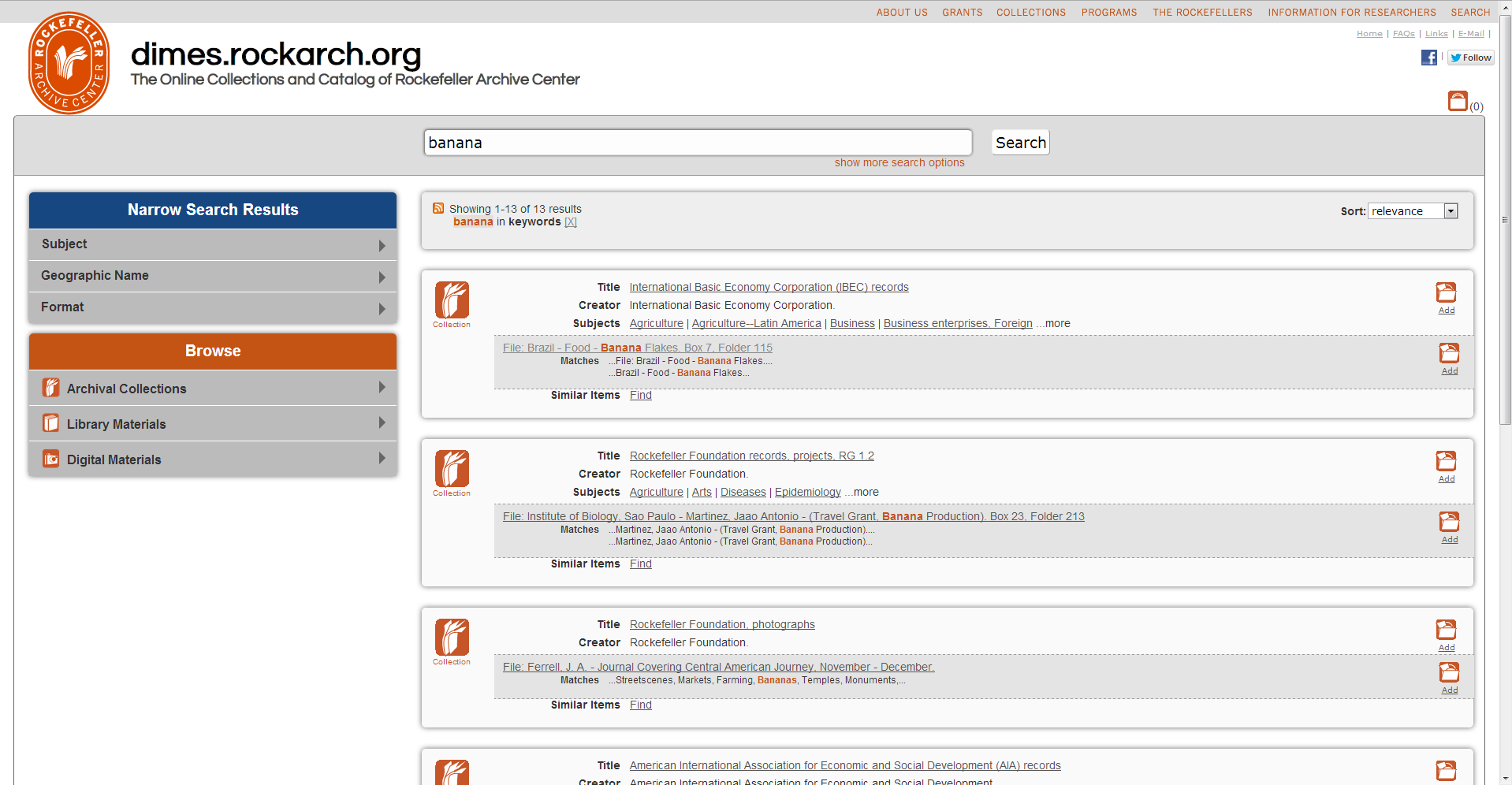 And then, well, I had to work on the pages for finding aids. Although there are a lot of obvious changes in appearance with these pages, one of the most important changes was an improvement in the way the table of contents in container lists is built, which will help finding aids load faster. I also added some code that scrolls the series or subseries that contains a folder into view in the table of contents, so if a user jumps into a finding aid from a search result, they will know what series or subseries they are looking at. I also made some changes to the display of the bookbag icon in the container lists, as well as the page which shows the content of the bookbag.
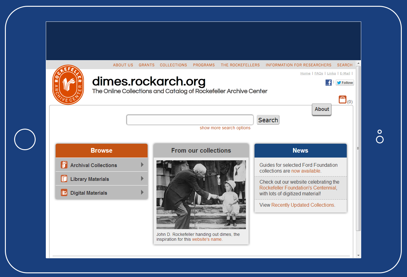
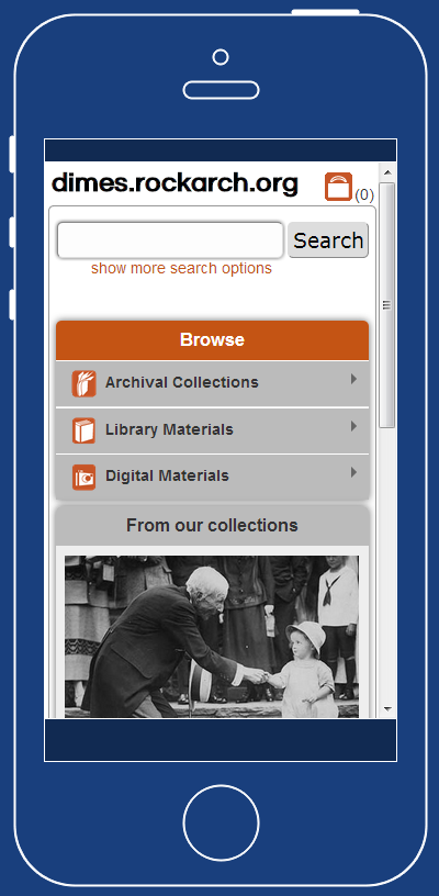
Finally, if you look at the website on your phone now, you’ll notice that it looks significantly different than it does on your desktop computer. That is because I’ve added in code which looks at the screen resolution of the device that is accessing the website and adjusts the display of elements accordingly. Below you can see a couple examples of how the home page looks on a phone or a tablet. In the web design world, this is known as responsive design.
Before pushing out these changes, I did some testing with staff and researchers, and based on the observations everyone made, as well as bugs they uncovered, I was able to improve the system substantially. As a result, even though this is a big change to the system, I feel confident that it’s a step in the right direction. I hope you enjoy using the new DIMES, and look forward to hearing your feedback and suggestions on how we can continue to improve it!