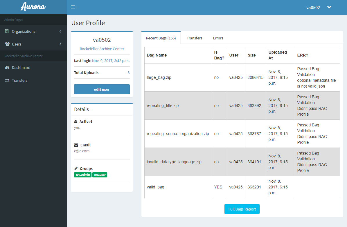
As development of the Project Electron transfer application has continued over the past month, one important aspect of the work has been the creation of user interfaces based on the wireframes we have designed during the design planning process. In this month’s update, I will discuss how both wireframes and the resulting user interfaces (UIs) of the application are important communication tools both internally for the development team, and externally with user groups including Rockefeller Archive Center staff and donors.
Wireframes
We created the initial set of project wireframes during the first hackathon as a collaborative effort with the Marist College development team. These consisted of informal sketches generated as a group with markers on a whiteboard, and allowed us to talk through how our defined requirements would be enabled through the interfaces. After the hackathon, we formalized the whiteboard sketches using simple tools in LucidChart. The resulting wireframes emphasized the essential page elements, structure, and navigation of the transfer application UIs for archival staff to manage donor organization accounts and users, as well as for tracking transfers and errors messages. In addition to creating these structural blueprints for UI design, the process of creating the wireframes as a group was essential to get all of the project participants on the same page.
The second phase of development, which is focused on enabling the appraisal and accession of records transferred by donors, necessitated additional UIs with more complicated functions like allowing RAC staff to review and manually accept/reject transferred records, group sets of records into accessions, and integrate with ArchivesSpace to create archival accession records. The RAC team created wireframes for UIs that would integrate these functions into the new application as part of the appraisal/accession planning process. Taking a slightly different approach from the communal whiteboard sketching of the first wireframes, creating and sharing these during the planning stage was valuable as a visual communication to clarify requirements, the scope of work for project management purposes, and to allow developers to start thinking about technical implementation.
I recently completed a third set of wireframes for the design of UIs focused on managing PREMIS rights information and Bag-It profiles for our donor organizations (a topic for a future blog, perhaps). Again, these comprise an important communication tool that defines complicated concepts and requirements visually. Project team members unfamiliar with the structure of PREMIS rights statements, for example, can learn from wireframes that visually represent how a user can create and edit these statements. While the final design details are likely to shift in development, the visual implementation of wireframes can serve as a common jumping off point for the entire team.
User Interfaces
Just as wireframes are a valuable internal _communication tool for the development team in the design process, creation of the application’s UIs have enabled _external communication with project stakeholders and user groups. Even in early forms, the application’s user interfaces allow us to demonstrate function concretely to RAC staff and leadership who will be implementing and using the application for the archival management of born-digital records, and to donors preparing to use the application for the transfer of those records. The user interfaces are a tangible representation of what Project Electron is and will become.
One of the Project Electron values that guides are work is to place users at the center of the design process. Throughout the project we have incorporated this user-centered design approach through activities like user group interviews, creating personas and user stories, card sorting exercises, and user scenario mapping. These activities were foundational for generating project requirements and for involving users in the design process. Being able to show the applications to user groups through the interface has been a valuable way to communicate function, and therefore to facilitate discussion and action toward other important aspects of Project Electron such as institutional planning, staff training, preparation of donor infrastructure, and project advocacy.

Sharing early versions of the UIs has also been a chance to receive user questions and feedback since certain application functions can be understood more clearly via a UI than through a list of requirements or process diagrams. This can give us a chance to incorporate early feedback into the design and think about possible future enhancements. We have been careful in our sharing and presentation of these UIs to emphasize that we are still in the early stages of development, and that there is an iterative process of design. While early insights and feedback can be very valuable, we also want to make sure we are communicating accurately about what the final application might look like, not getting into the weeds of implementation specifics.
Next Steps
At this point in the application development, all of the major UIs have been sketched out with wireframes. Moving forward, however, wireframes may continue to be a useful design and communication tool as we enhance existing pages or incorporate application functions. We will continue to share the application with its future users, relying on the UIs to communicate use and function. As the design and application functions expand and improve with development, we are excited to share our progress and incorporate user feedback.