Following our initial release of Aurora, we’ve continued to improve the application through usability testing with RAC staff members. This process has been essential in identifying usability issues in Aurora and guiding our strategy to implement fixes to address those issues. In this post, I want to share our approach to usability testing, a summary of our findings and fixes, and our next steps.
Lightweight usability testing
We conducted four in-person usability tests with members of the Collections Management team, some of the primary users of the application at the RAC. All participants had minimal previous interaction with Aurora, although they were familiar with its overall purpose and function.
Each test lasted approximately one hour, and was organized around six specific user tasks designed to engage the major functions of the applications. Using a script to standardize contextual information and direction across all participants, I guided participants through the test process, encouraging them to think aloud as they attempted to accomplish each task. Other project team members observed the tests remotely in order to maximize understanding of user actions while minimizing intervention in the user’s interactions with Aurora. With users’ permission, I recorded the tests (audio, video, screen capture) using Morae.
After each session, our project team held a debrief to identify the major usability issues and decide which should be addressed before the next test. We tracked issues with the Asana project management tool so their status could be updated. Where appropriate, we applied fixes to issues between tests so that those fixes could be evaluated. In planning this approach we drew heavily from the recommendations of Steve Krug, particularly from the book Rocket Surgery Made Easy: The Do-It-Yourself Guide to Finding and Fixing Usability Problems.
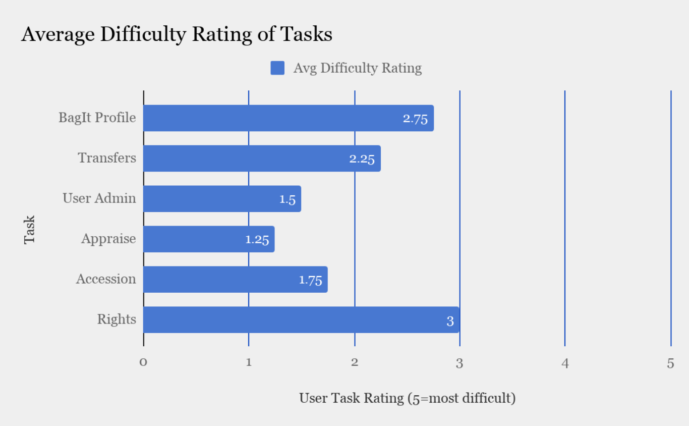
The tasks
We designed six tasks to test the primary functions and features of the application. Upon completion, the user rated the task on a scale of 1-5, with 5 being the most difficult. To contextualize the tasks, we embedded them in scenarios that a user might encounter while using Aurora, such as an archivist responding to a query from a donor about why a transfer was rejected by the application.
| Task | Description |
|---|---|
| BagIt Profile | Create a BagIt Profile for a specific organization |
| Transfers | Locate a transfer in the transfer table, interpret transfer status, view details, locate an appraisal note, and find and interpret transfer logs and error messages |
| User Admin | Navigate to the user admin page, locate a user’s recent transfers and user details |
| Appraise | View details and accept a transfer in the Appraisal Queue |
| Accession | Locate a transfer in the transfer table, interpret transfer status, view details, locate an appraisal note, and find and interpret transfer logs and error messages |
| Rights | Create an accession record |
Summary of findings
Users were very positive in their interactions with the application. Even in cases where they struggled to complete tasks, they affirmed the ease and comfort of using the application both verbally and by assigning low difficulty ratings to tasks.
We identified a number of usability issues and fixed them during the testing period; these were primarily related to confirmation and error messages, navigation, and visibility of features. We also identified issues related to BagIt Profile and PREMIS Rights statement creation and editing, and are planning another round of testing to address those features.
Identifying and addressing usability issues
We identified 8 major issues or groups of issues where users encountered challenges in using Aurora, and implemented a number of fixes to address each of them.
1. Users looked for visual confirmation that an action had been completed successfully.
Many tasks required actions such as approving a transfer in the appraisal queue or creating an accession record. Users looked for visual cues to confirm their actions were successful. In cases where these were not provided, we added confirmation and error messages, and moved existing error messages to the top of the page to improve their visibility.
2. Some information, navigation elements, and features were not visible to users.
We made several changes to Aurora’s interface to address problems of element visibility including increasing the size and color contrast of the side navigation and search function, increasing contrast in table striping, alphabetizing lists, changing button styling, and adjusting the visual hierarchy of information.
3. Users had difficulty locating the table containing a list of all transfers, mistaking a “recent transfers” table for the full table.
Our primary fix for this problem was to add a “View all transfers” button below the recent transfers table. We also simplified the recent transfers table to contain fewer columns/details and, as noted above, increased the visibility of the side navigation.
4. Lack of metadata (indicated by a “No metadata available” message) for invalid bags was misleading.
This was a simple issue that we fixed by removing the metadata information box in the transfer detail page for invalid bags so that users would not be misled about why the bag was invalid.
5. When viewing transfer details from the appraisal queue, users looked for a way to accept or reject the transfer from the details page.
Once a user had reviewed the details page of a transfer, they had to navigate back to the appraisal queue and relocate that transfer in order accept or reject it. We addressed this by replacing the details page with a modal window.
6. One user wanted to view the bag manifest as part of the transfer details during appraisal.
Agreeing that this was a useful feature, we added a display of the bag manifest.
7. In navigating the accession functionality, multiple users looked for visual indications to confirm that they were in fact in the process of creating an accession record.
We changed page titles to improve clarity, changed the text on the “Create Accession” button, and styled the accession form more clearly to group types of required information.
8. Users were unsure what information they should enter into certain form fields and in what format.
All users expressed uncertainty about the input type and format for information they were entering in certain fields in the BagIt Profile add/edit form and the rights statement forms. We added help text and tooltips, and plan to continue testing and improving these interfaces in the future.
Next steps
Our process of fixing small issues between sessions allowed these fixes to be tested with the remaining users. As a result, the most obvious usability issues were addressed by the time the testing was completed. However, the user interfaces related to the creation and editing of BagIt Profiles and PREMIS rights statements require further testing. We’ve made some changes to these interfaces based on what we learned in the first round of testing, and plan to evaluate them in a second round.
Additionally, we will be undertaking an accessibility audit of Aurora to assure its usability based on Section 508 and W3C’s Web Content Accessibility Guidelines. With the encouragement of the Ford Foundation, particularly Ford’s Global Records and Archives Manager Andrea Donohue, it’s a priority for us to make Aurora’s web interface accessible for all users. I plan to share more about our work in this area in a future blog post.
Finally, we’ll be reaching out to some of our donor organizations to initiate some remote usability testing. While our donors will not be engaging in the archival or organization management functions of Aurora such as appraisal, accessioning, or creating rights statements and BagIt Profiles, they will need to track their transfers of records. We want to ensure that Aurora is intuitive and informative for them as they seek information about the status of transfers, associated metadata, error messages, and logs.