As part of an effort to standardize Rockefeller Archive Center’s approach to the visual styles of our websites, we have recently developed a Sass style library and a RAC style guide to visualize website components and document best practices for their implementation. Based on the design treatments created for us by the design firm ondesign for DIMES and rockarch.org, this library and corresponding RAC style guide put us in a position to be able to unify the visual language of our websites and applications in a way that is maintainable, will improve future design processes, and is more accessible for users.
What Our Websites Look Like Now
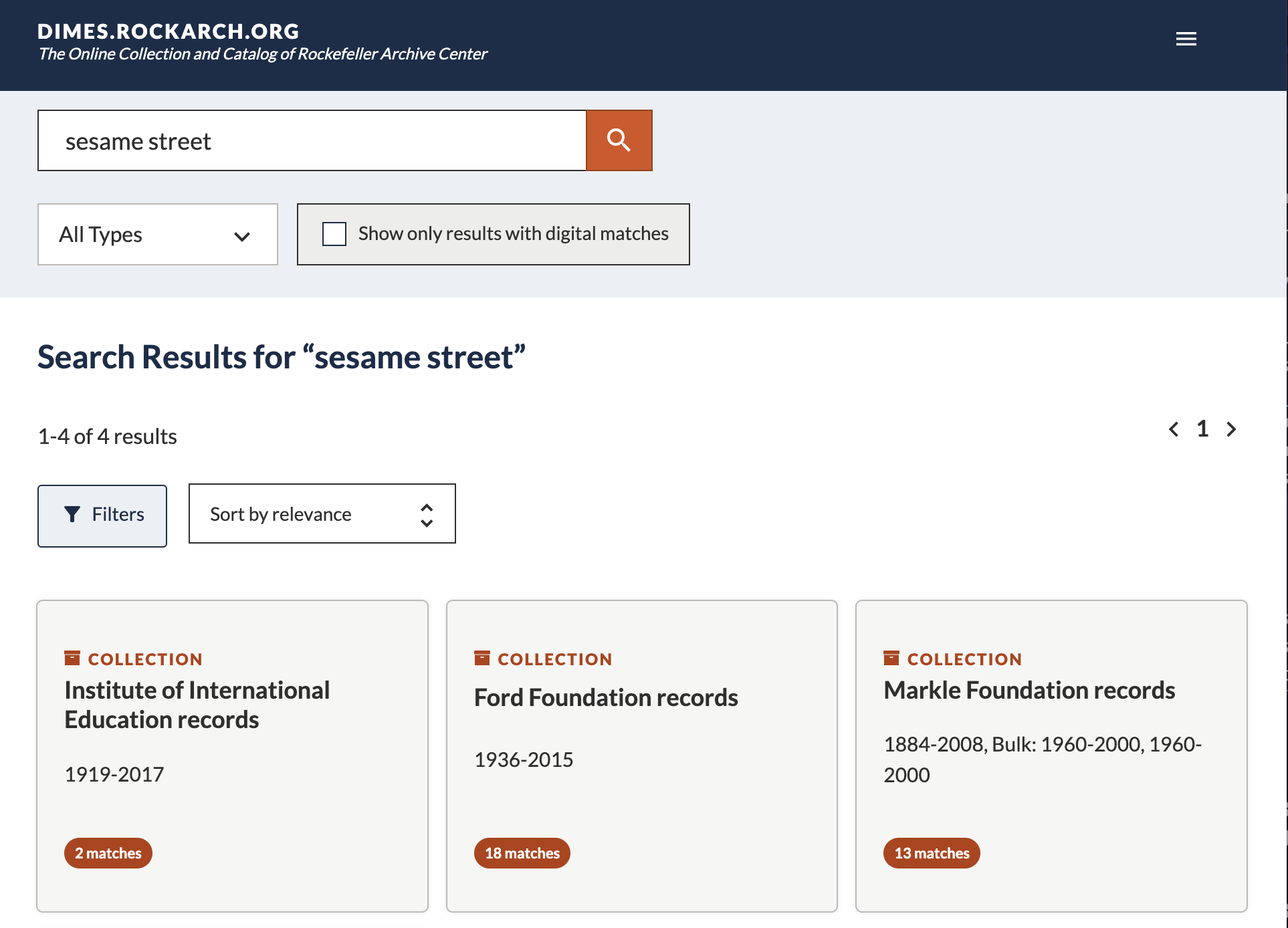
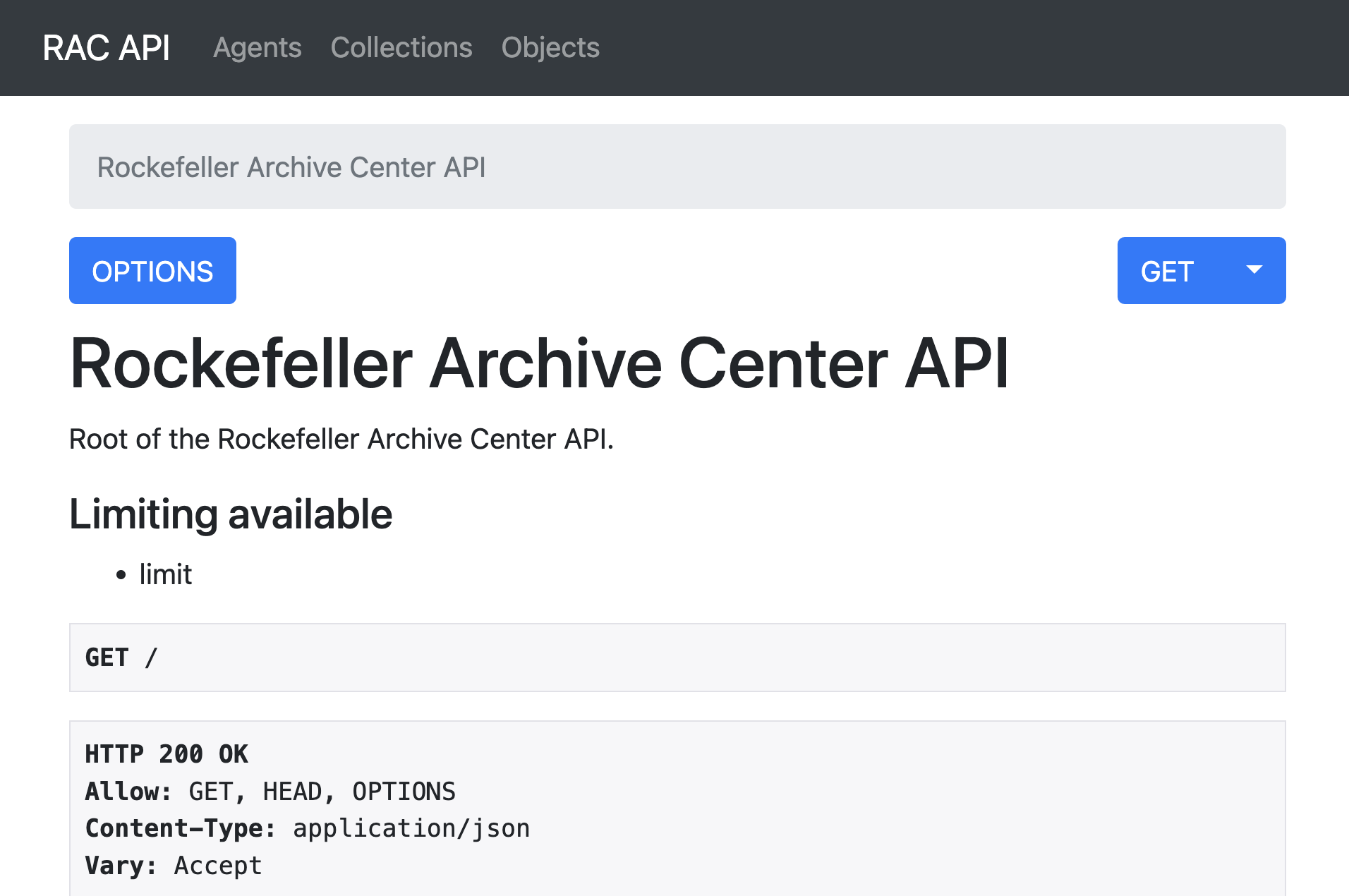
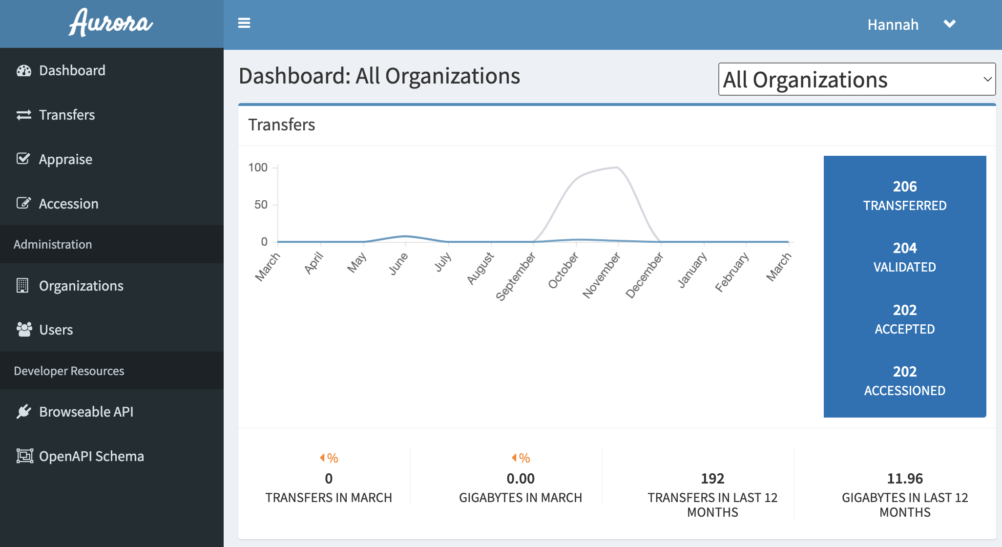
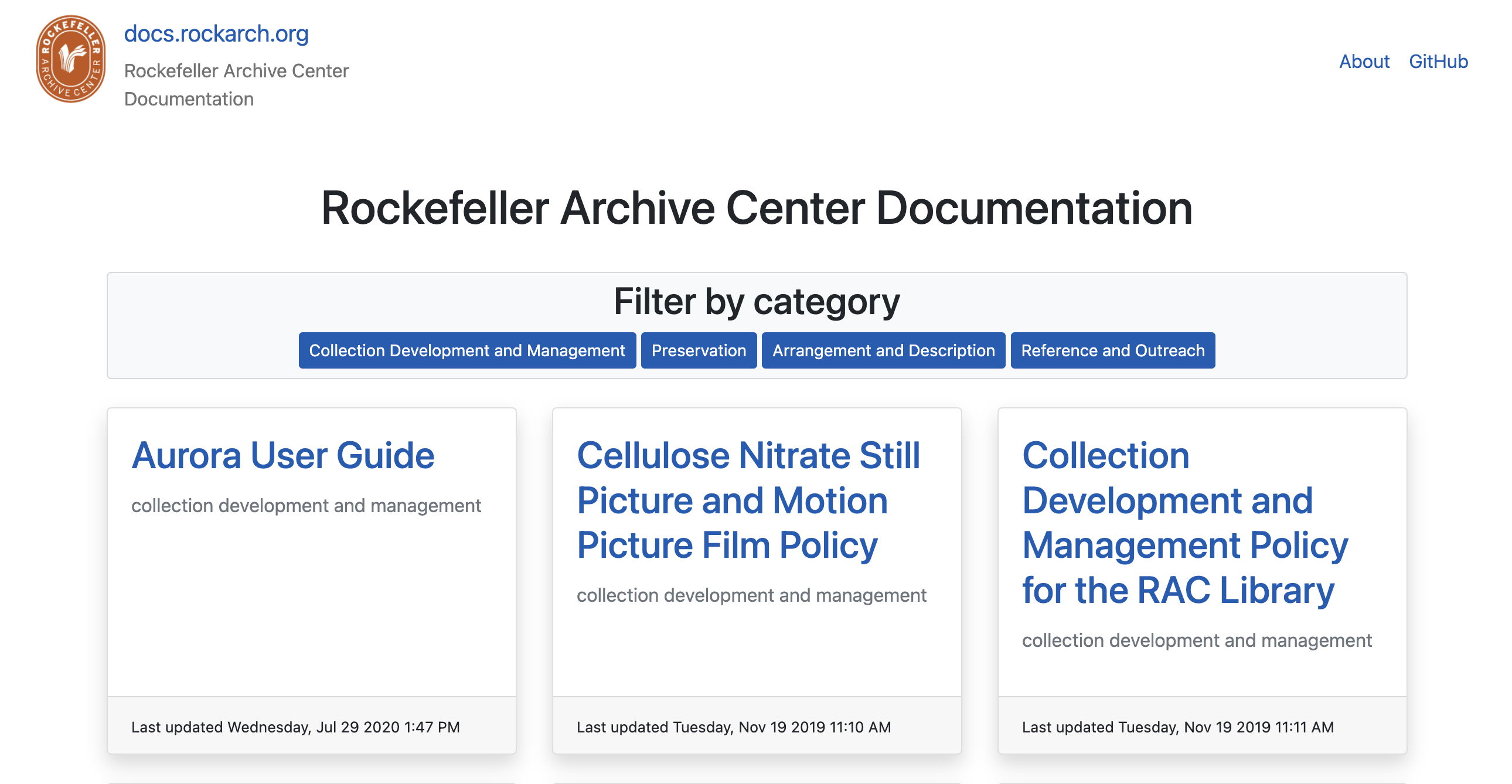
Rockefeller Archive Center manages a number of websites and applications that until recently did not have a cohesive or documented approach to visual style. The Digital Strategies team has historically relied on existing libraries like Bootstrap and static site themes (like the one this blog uses) to be able to quickly apply styles, manage layout, and ensure responsiveness to various screen sizes. While these solutions have allowed us to scaffold up new sites and tools relatively quickly, we lack a cohesive visual approach, repeat work by customizing styles for each new site, and spend unnecessary effort auditing and correcting digital accessibility issues for styles that do not meet Web Content Accessibility Guidelines (WCAG) for criteria like ensuring sufficient element color contrast and hover/focus styles. With ondesign’s designs, we now have a visual approach that can be reused across sites and expanded, including colors, fonts, headings, buttons, form elements, modals, cards, and other components.
The images below show a few examples of the various styles used across our current websites:
Building the Storybook Style Guide
We built the style library and style guide concurrently so that we could test and document things as we worked. The first step was to define the components we use across our sites, recording what they are and where they occur to make implementation easier once we finished building the library. With the components defined, we researched style guide generator tools, settling on Storybook to manage, display, and document components because of its flexibility and potential to allow RAC staff who aren’t as familiar with web development to contribute to design processes and accessibility auditing. Thanks to our colleagues from the Wellcome Collection who shared their experiences with us about how they used Storybook to develop their pattern library, Cardigan.
Pulling from existing site code, we added our components to Storybook with basic HTML, the CSS classes we planned to use from our existing styles, and documentation about each component including when to use it, best practices, related components, and known issues. We went back to basic semantic HTML here, taking care to build in accessibility from the ground up and referencing existing design systems including the GOV.UK Design System, Atlassian Design System, Carbon, and A11y Style Guide.
Building the Sass Library
Sass is a preprocessor of SCSS, which is compiled to CSS, which provides styles for a website. Because we had already implemented component styles in rockarch.org and dimes.rockarch.org, we were able to pull in existing SCSS from these sites to build on as we created the library. However, while we started with existing SCSS, we also refactored, updated, and organized the styles to be modular and reusable in different contexts. I started by setting up a structure based on the 7-1 architecture pattern with Kitty Giraudel’s sass-boilerplate. I brought in some global styles like colors, typography, icons, and other classes used across multiple components. Then the Digital Strategies team ran a two week sprint where we were each assigned a set of components and worked together to add the styles not only as a way work quickly, but also to develop CSS/SCSS competency across the team.
Sass Conventions and Linting
Following recommendations from the Sass Guidelines to standardize and improve maintainability, we used:
- The BEM (Block, Element, Modifier) Methodology, a naming convention for CSS classes.
- A liberal approach to comments to ensure the styles were well documented and accessible to future maintainers and colleagues writing CSS/SCSS.
- stylelint to enforce conventions and catch errors.
- True for unit tests to ensure that Sass functions and mixin outputs are correct.
An Iterative Process
As we built the library, we used Storybook to see how the styled components and their variations appeared. We made inevitable changes to component structure and styles as the code was copied over from our existing sites, and we documented those changes to track what will need to be updated when we implement the style library back into those sites.
We also added the Storybook stylelint-a11y plugin to run certain automated accessibility checks on the components, recording any issues in component documentation for future remediation. The most common issue flagged was a background color in our designs that we need to pair with a different text color to meet WCAG 2.x AA color contrast ratio standards. We’ll review these documented issues to address comprehensively before implementing these styles across our sites.
What’s Next
Now that we’ve developed these styles and components, we are ready to implement them in our sites. For DIMES and rockarch.org, this will mean adjusting existing code to align with the conventions and best practices we have established for the components’ HTML and CSS. The websites themselves shouldn’t look much different, though, and we can use visual regression testing to help identify unanticipated changes. For other sites that primarily use various Bootstrap themes, we’ll need to make more invasive code changes. We plan to do this work collaboratively with colleagues from other RAC teams to build web development skills and expand knowledge about how our sites are developed and maintained.
We’re looking forward to more coherently connecting RAC websites for our users, building staff expertise in writing well-documented, modular, and reusable code, speeding up design processes for future sites, and baking digital accessibility into our websites from the bottom up.