In her most recent blog post, Hannah wrote about our approach to Project Electron’s proposed systems integration architecture. One of our goals with Project Electron is to support the flow of data about digital materials between our systems and getting valuable information to researchers in new ways. Supporting data in motion is integral to Project Electron’s success, and while Hannah and Hillel have been hammering away at creating a comprehensive overview of the microservices architecture, I’ve been working with the entire archive center to develop a draft data model for discovery and display of born digital and digitized materials. If, as we’ve been thinking, Project Electron is about creating infrastructure to support data, a data model will in turn act as a blueprint for that infrastructure. Data models are tools we can use to communicate and define how we want data to move between systems, and we think understanding how our data will move throughout our systems to our researchers is vital to the success of the entire project.
The Process
Background
Over a year ago, in February 2017, we compiled an annotated bibliography on modeling data, linked data, and ontologies. Following the bibliography, we held staff-wide learning sessions on modeling data, which gave us an opportunity to meet with the larger RAC staff and get them thinking about data in different ways outside of the purely archival descriptive context. These sessions were extremely helpful in both calibrating so we were all using the same language to talk about data models, and creating a baseline understanding of the purposes behind modeling data. We were really laying the groundwork for later working with and critiquing possible Project Electron data models. These sessions weren’t merely altruistic information-sharing exercises, we also selfishly wanted people thinking about modeling in the context of data at the Rockefeller Archive Center.
Following these sessions, it was finally time to start dipping our toes into actual modeling. We decided to start with a discovery and display model for presenting data to researchers because it would help us think through which systems we’d be pulling data from in a more general sense. None of us at the RAC had much experience on actually creating a data model diagram, so our first steps were to revisit the model bibliography and reach out to other institutions to see what they were doing. In particular, many thanks go out to Alex Duryee at the NYPL for sharing a general discovery data model and providing some feedback on our earlier drafts, as well as the team at the University of Michigan’s Bentley Historical Library for providing robust comments on early drafts. I truly leaned on the expertise of others while learning. I think it’s here that I should also thank the creators of PCDM for creating such a solid basis to work from and creating great documentation for the project.
Diagramming
After reading up, looking at other diagrams, and working up the courage to actually make something, we ended up with the below image as a first draft. This draft model was dated October 17th, 2017 and you’ll notice that there’s a lot going on here.
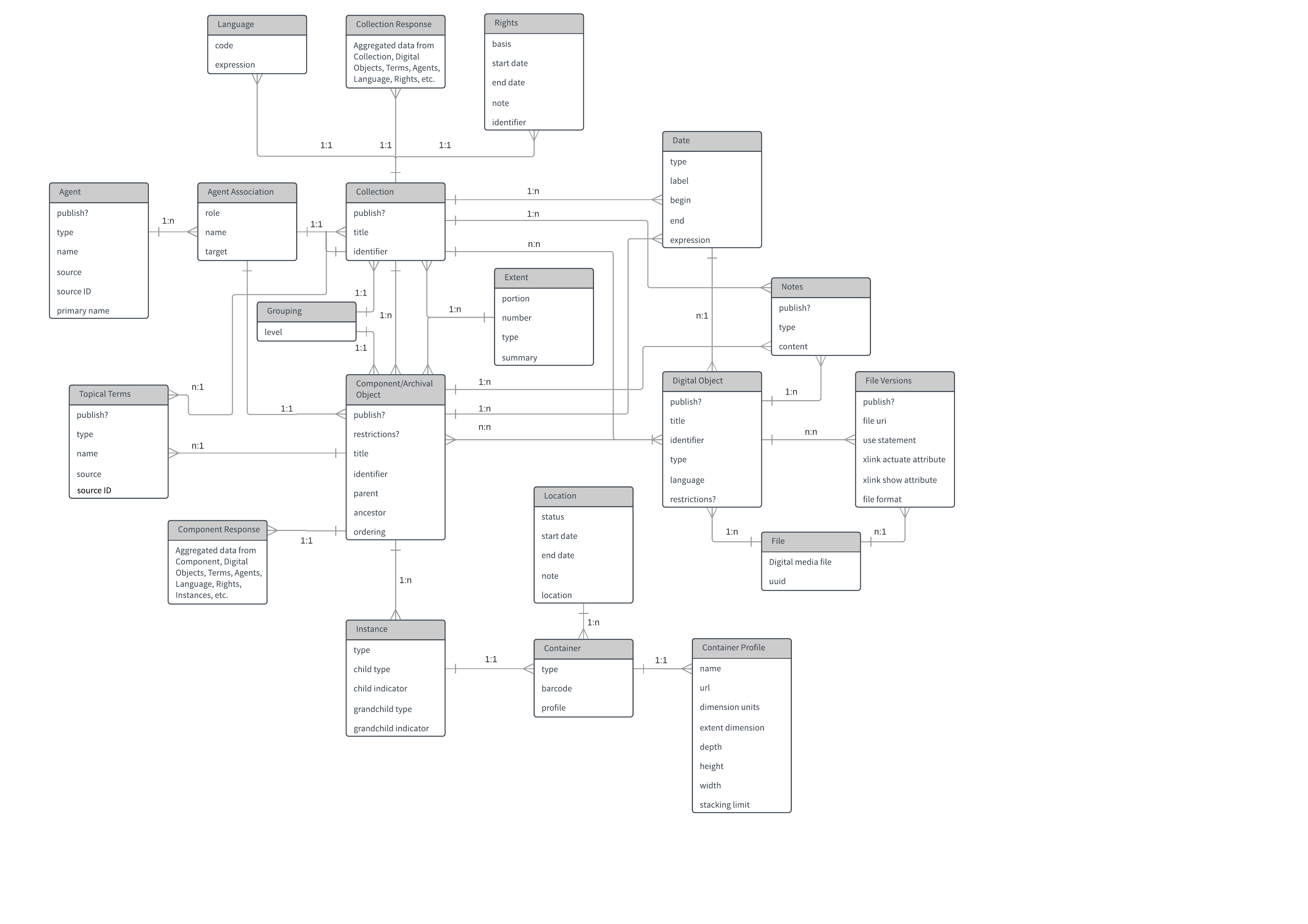
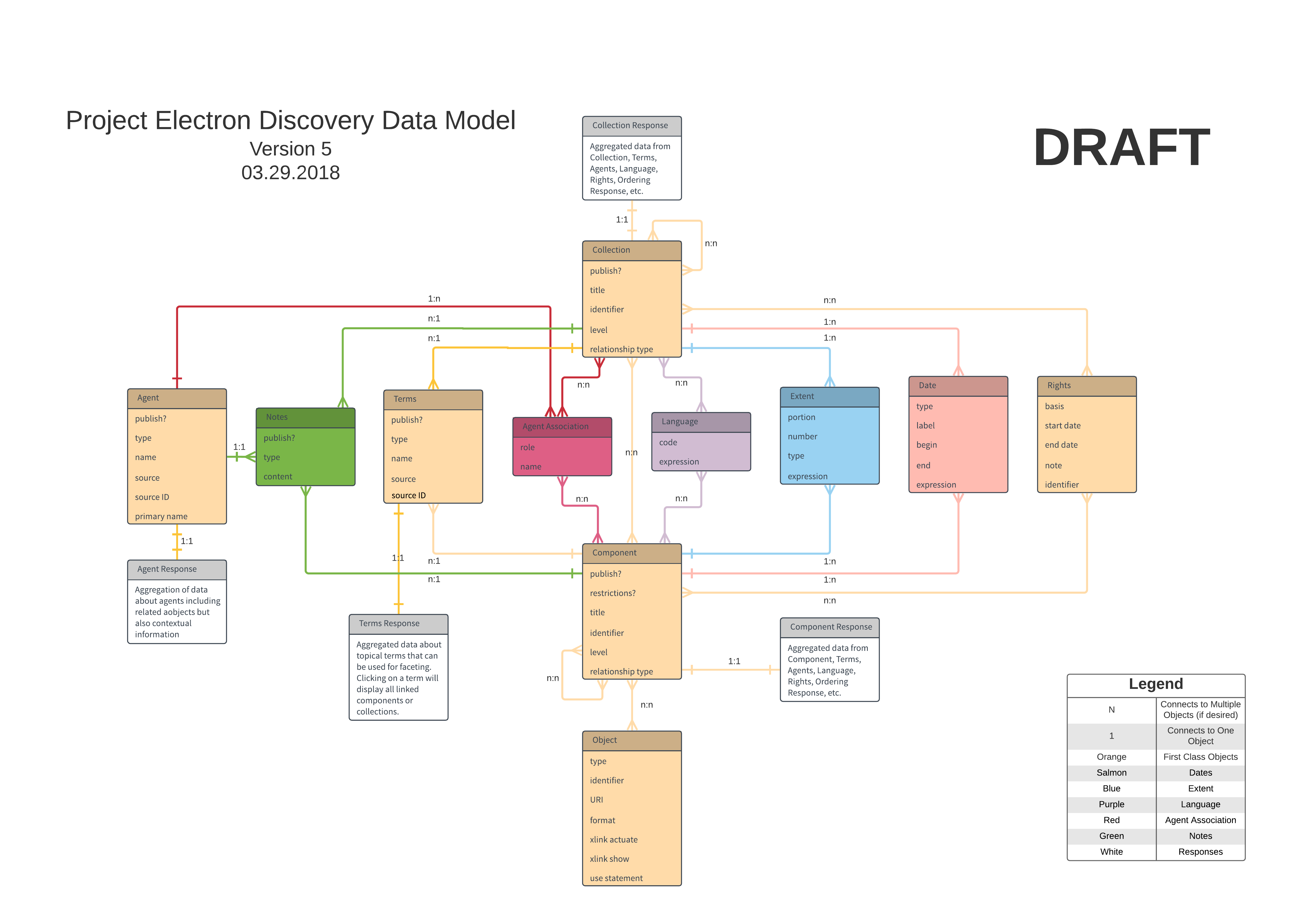
The diagram is messy, not laid out well, and difficult to read, and has more information than we ultimately decided was necessary. Following this first draft, we sat down as a team and talked about the data we thought was absolutely necessary to display to researchers, and, in the end, we settled on a DACS minimum level of metadata and description with information supporting the adoption of linked data standards. Our goal was to reuse as many existing vocabularies as possible while also allowing for the expansion of the model if necessary. The end result of these insular discussions was the below draft of the diagram.
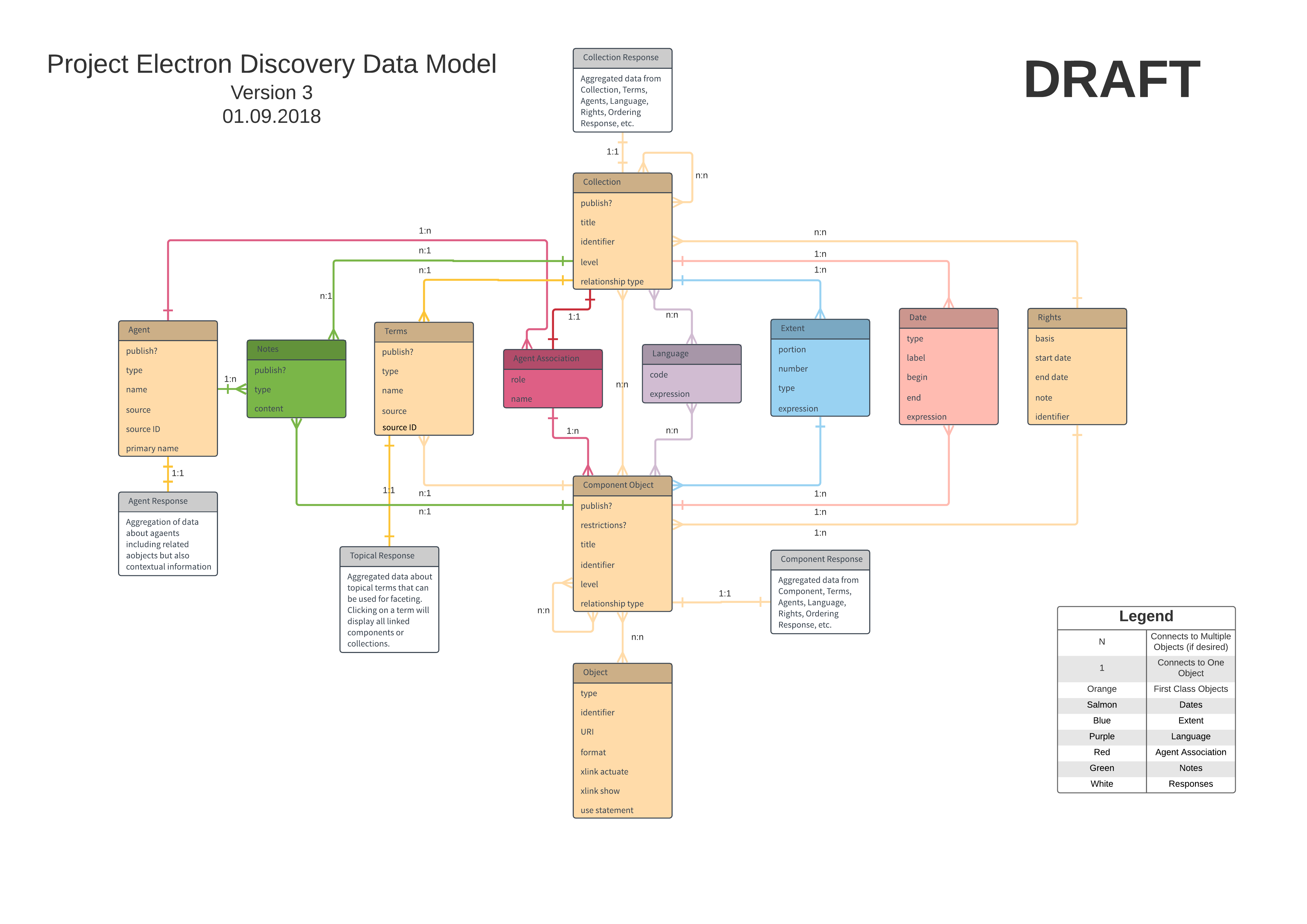
We thought this diagram properly reflected our thinking, gave others something to work with, and was clean enough to explain and understand. This version, created on January 9th, 2017, represented a start to the next phase of the process: testing, critiquing, and revising.
Testing
In late January, we started scheduling separate meetings with teams within our archival unit: Processing, Reference, and Collections Management. The goal of these meetings was threefold: introduce the staff at large to our data model diagram, explain the thought process behind its creation, and finally get groups to work with it and kick the tires. We started each meeting with a quick walkthrough of the model, but then we quickly dove into group activities. Our goal was to treat these meetings as informal user tests that would ideally uncover any false assumptions we had made during the initial modeling as well as provide insight into different ways our coworkers want to interact with data.
We asked the participants to break themselves up into smaller groups and then gave them three different user tasks to attempt using the data model and existing archival description as a guide. The three tasks can be summarized as:
- Use the data model to diagram data from a single finding aid.
- Use the data model and multiple finding aids to diagram data and the relationships between the three finding aids.
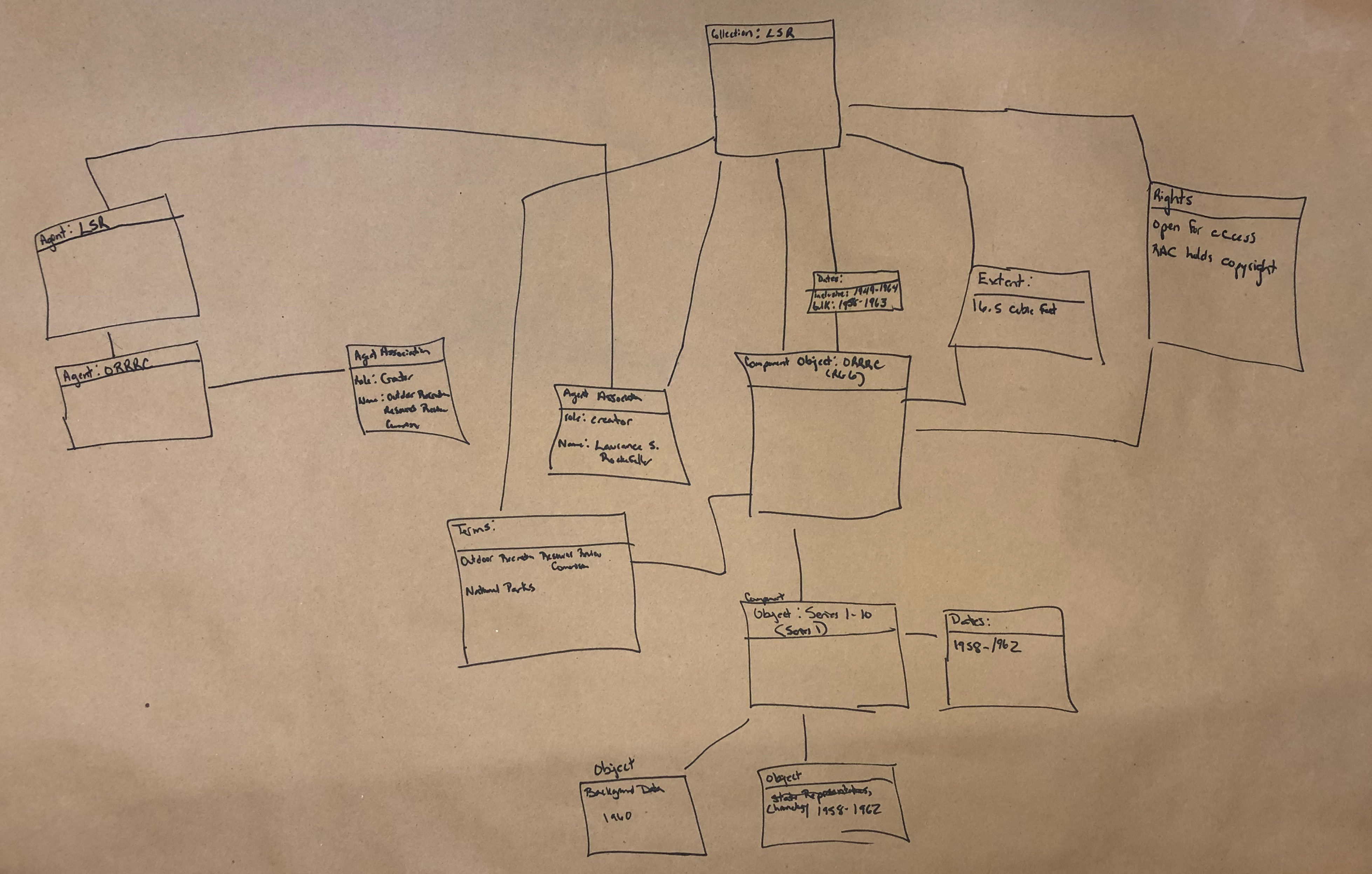
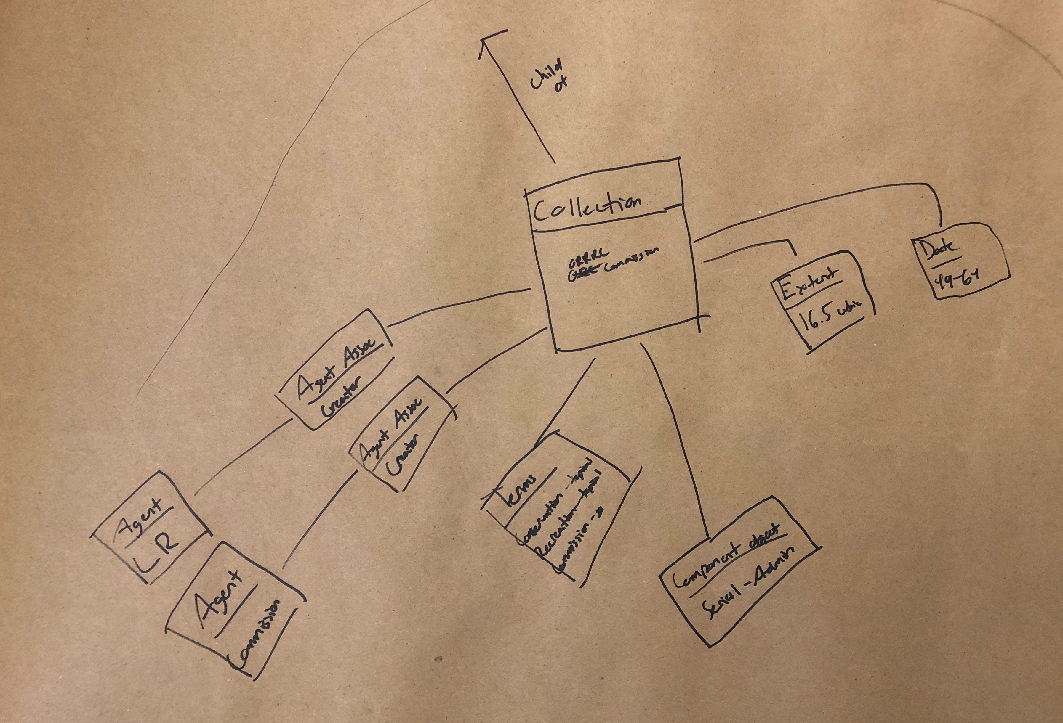
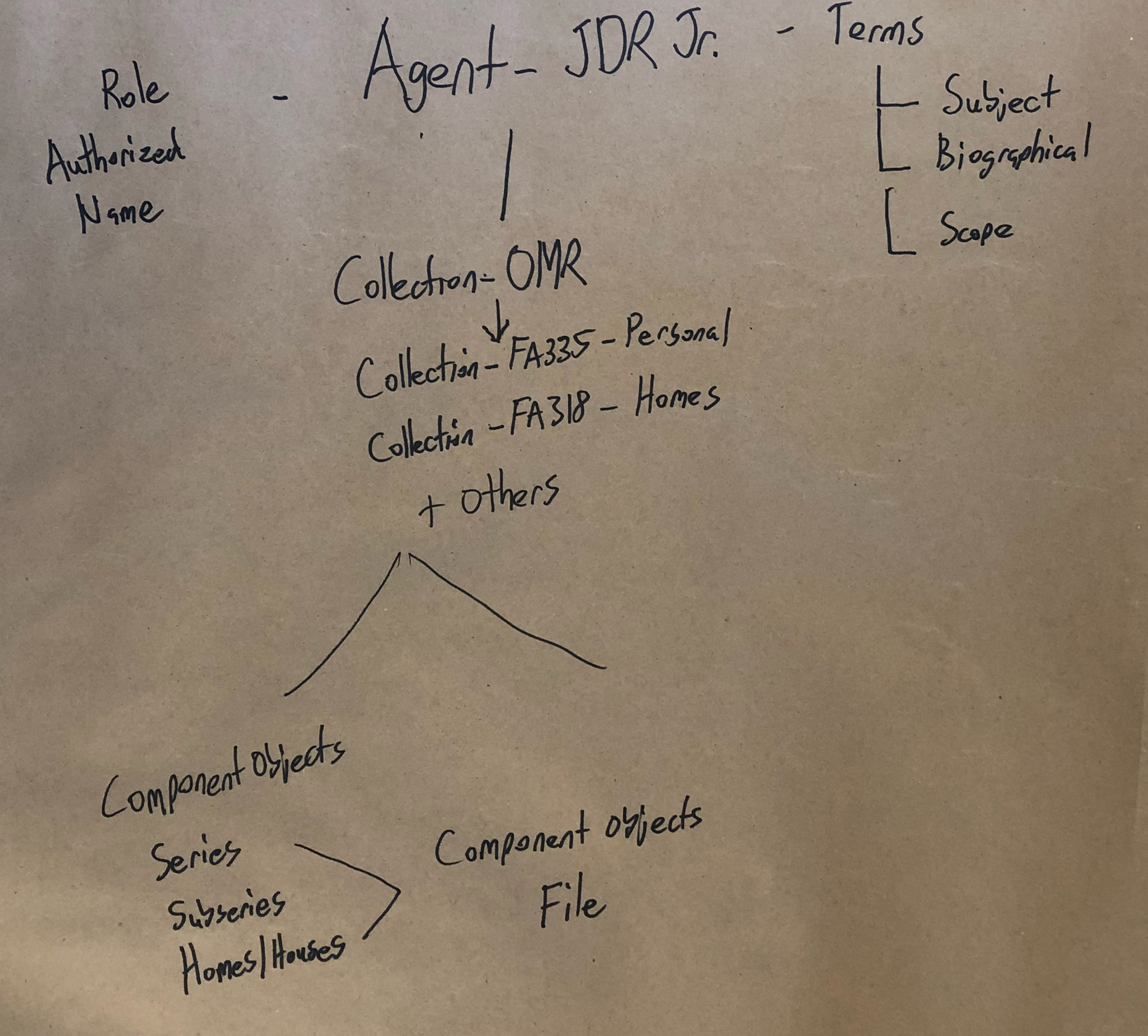
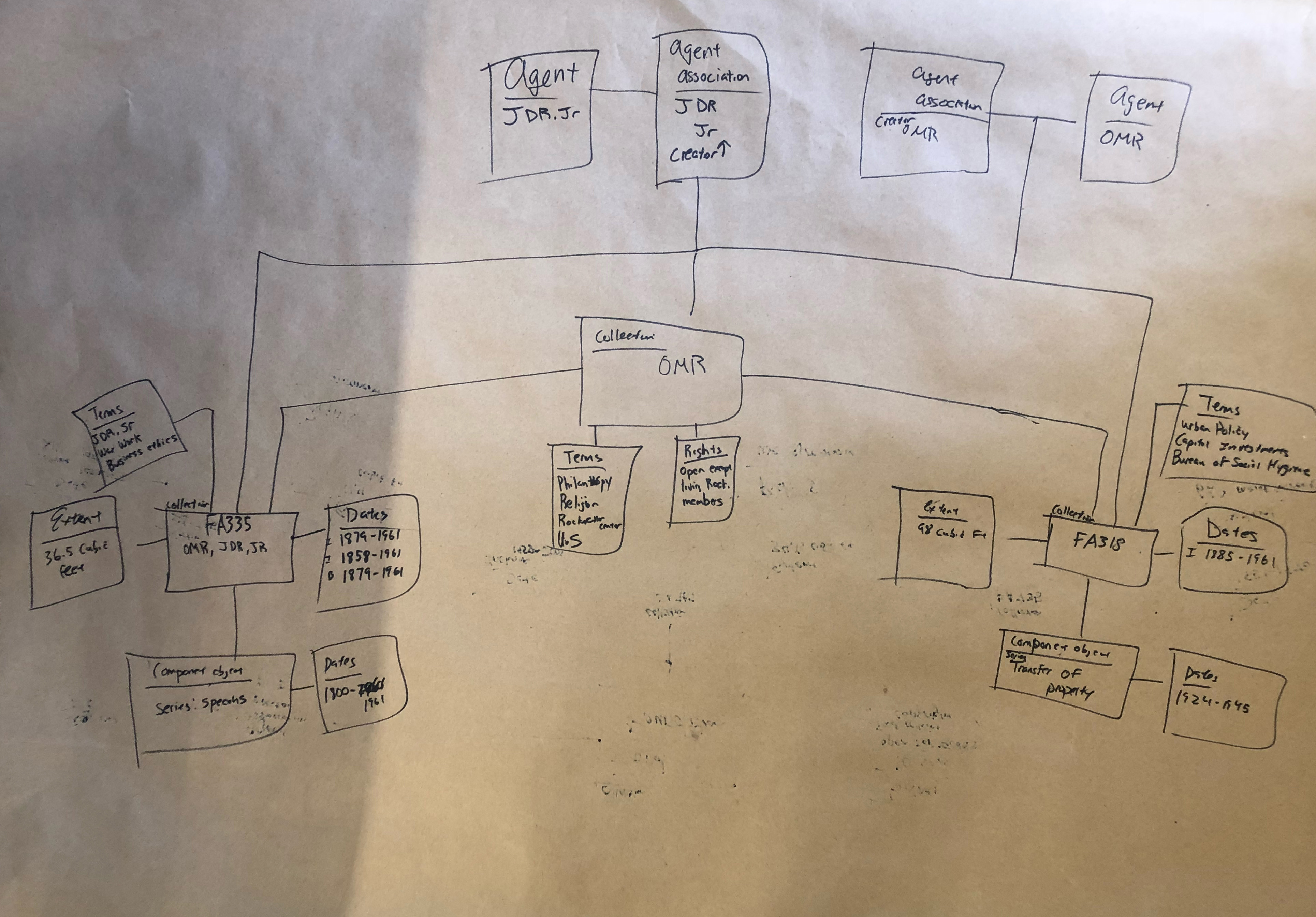
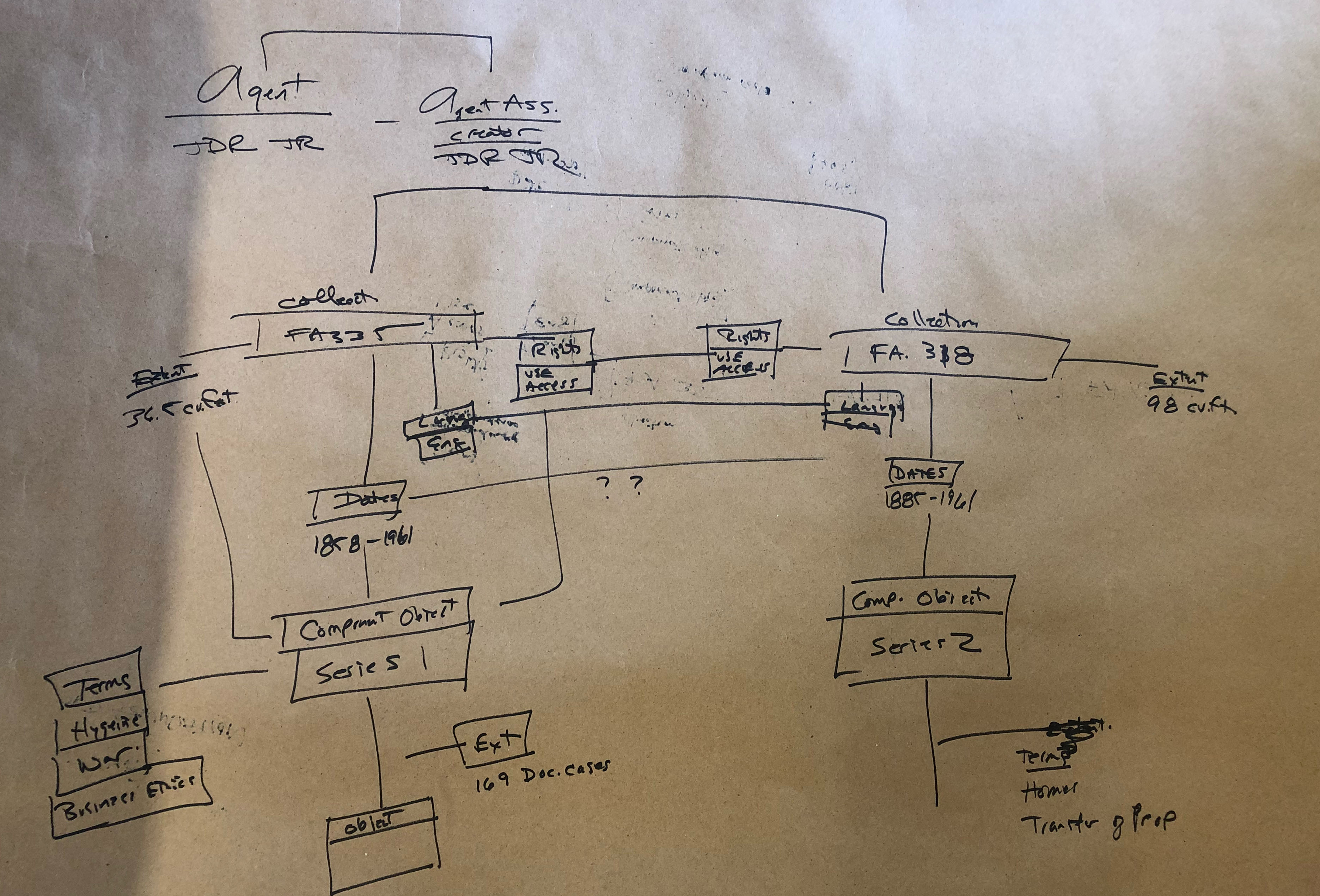
- Use the data model and two finding aids to diagram the data in relationship to an agent (John D. Rockefeller Jr.).
Expectedly, it took some time for people to wrap their minds around how to create model diagrams, which is why we started out slow with the first task. Despite our coworkers’ lack of experience in working with diagrams, they jumped in and came up with very illuminating work.
The Diagrams
I’ll breakdown the key takeaways we observed from these models at the end of this post, but we definitely unearthed a couple of intriguing behaviors that we’d like to explore in more detail.
Task 1
Task 2
Task 3
Takeaways and Final Draft
There’s a lot going on in these diagrams, and not all of them strictly fit within the confines of the draft diagram we provided for the groups to work off of. However, it’s our opinion that many of these deviations from the original diagram uncover insightful looks into the way our coworkers think about archival data and where they expect to find linkages and relationships.
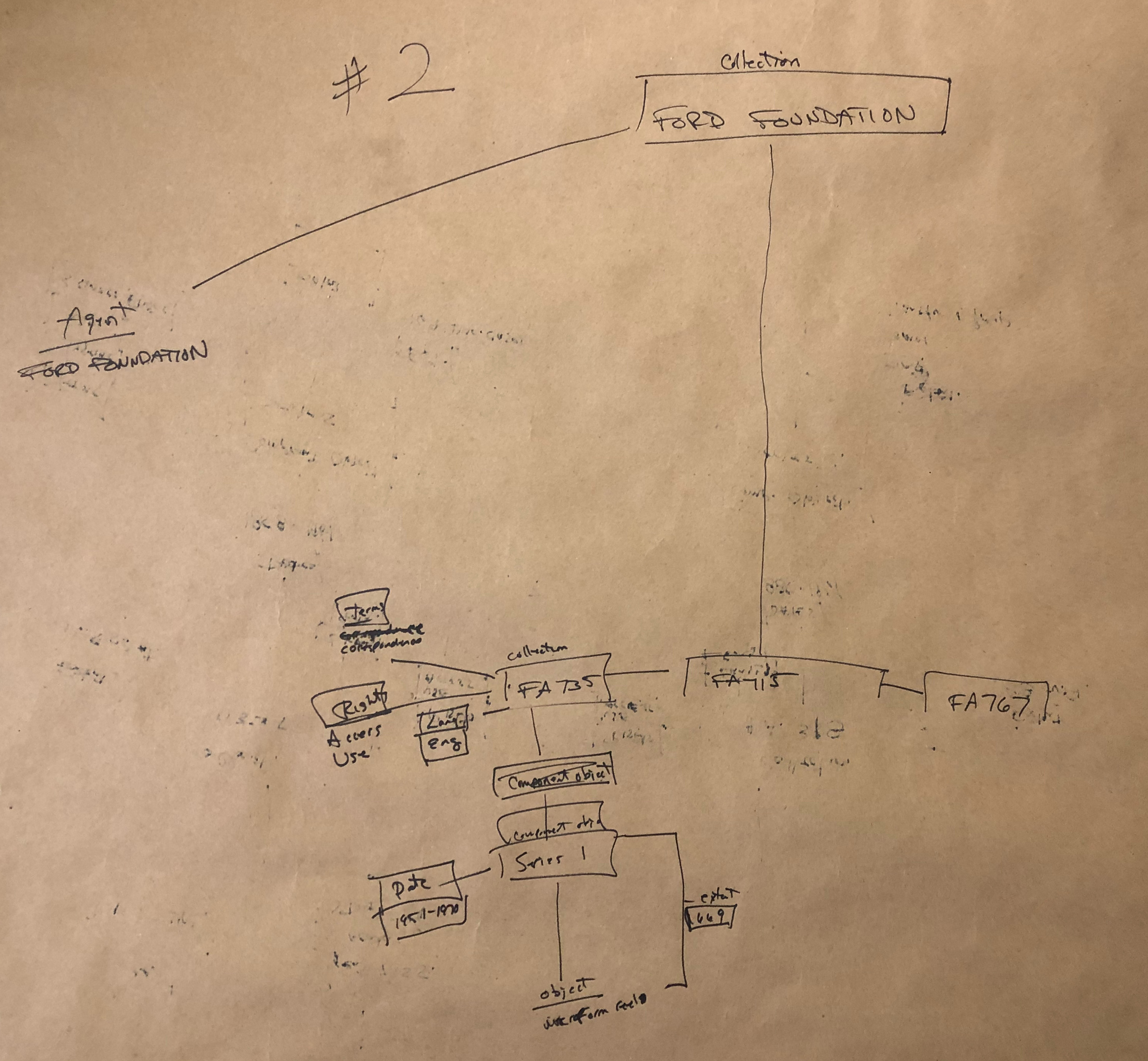
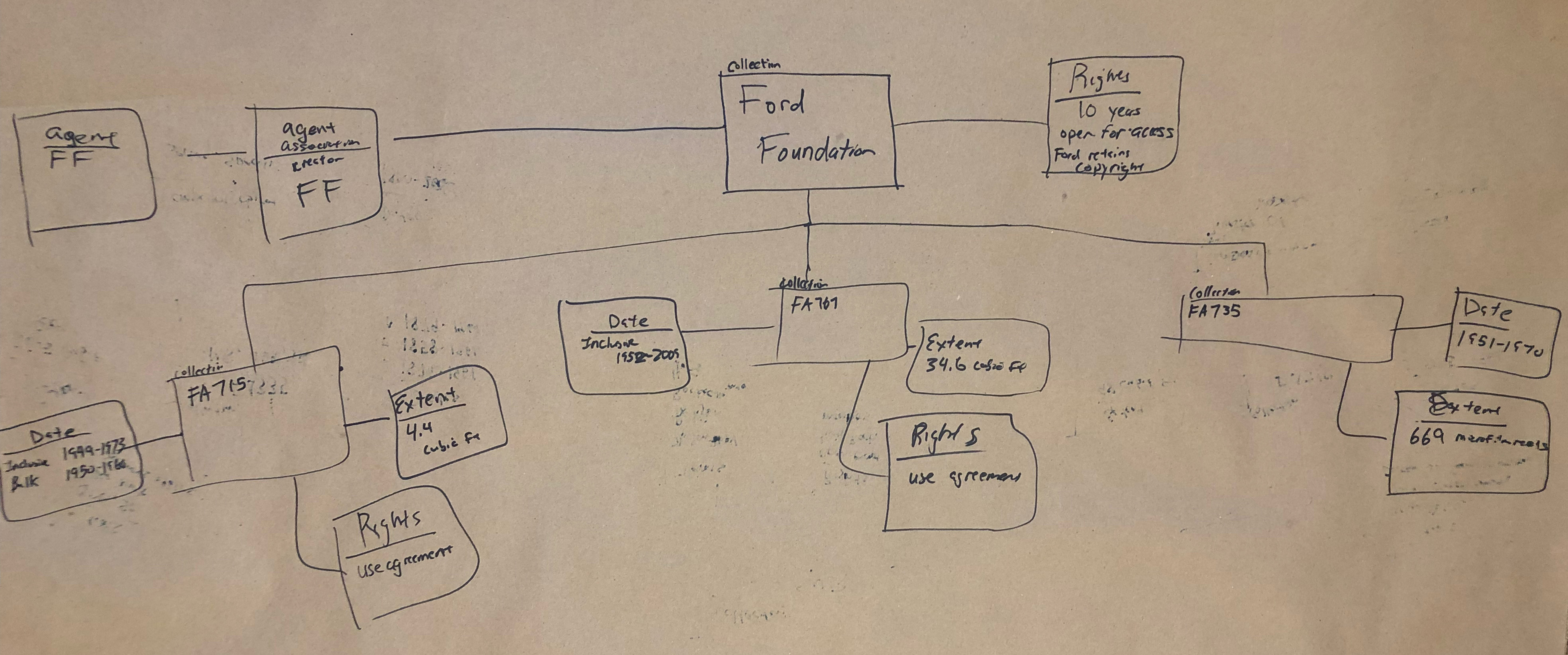
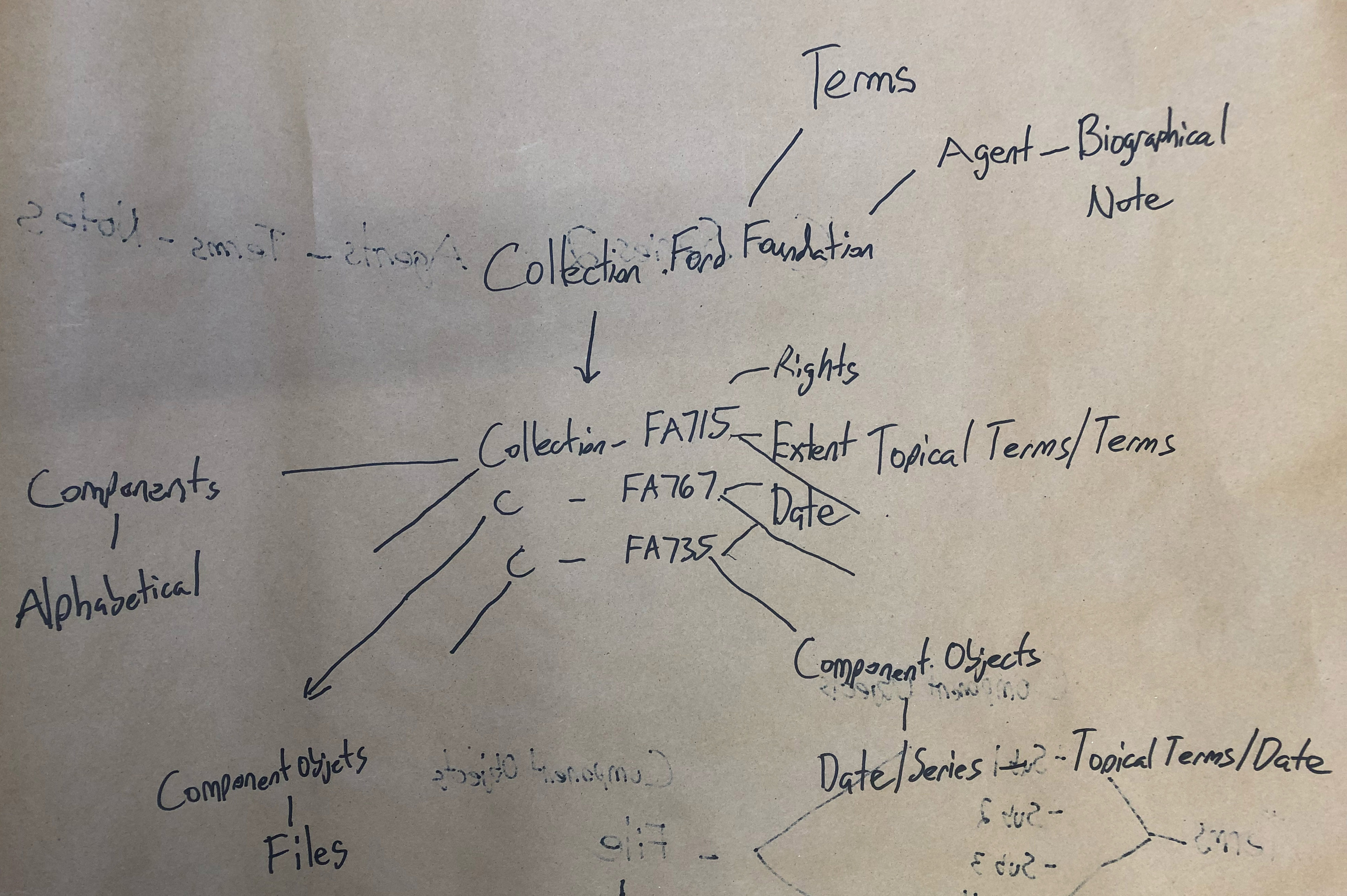
When looking at drawings from Task 2 we almost immediately noticed that many groups wanted to create what is essentially a blank node collection. The Ford Foundation is one of our largest and most prolific donors, we have a multitude of different finding aids for their materials, and sometimes it can be hard to find all of them through our discovery interface. What we saw in many of the diagrams is the creation of a greater Ford Foundation Collection, sometimes with agents or other data attached, and sometimes just by itself. No such overarching Ford Foundation collection exists in our archival description. When asked about the motivations behind making the blank node, the answer was often extremely simple: it’s hard to find the entire corpus of Ford Foundation records and being able to start with only Ford Foundation materials is a more desirable starting point for research purposes.
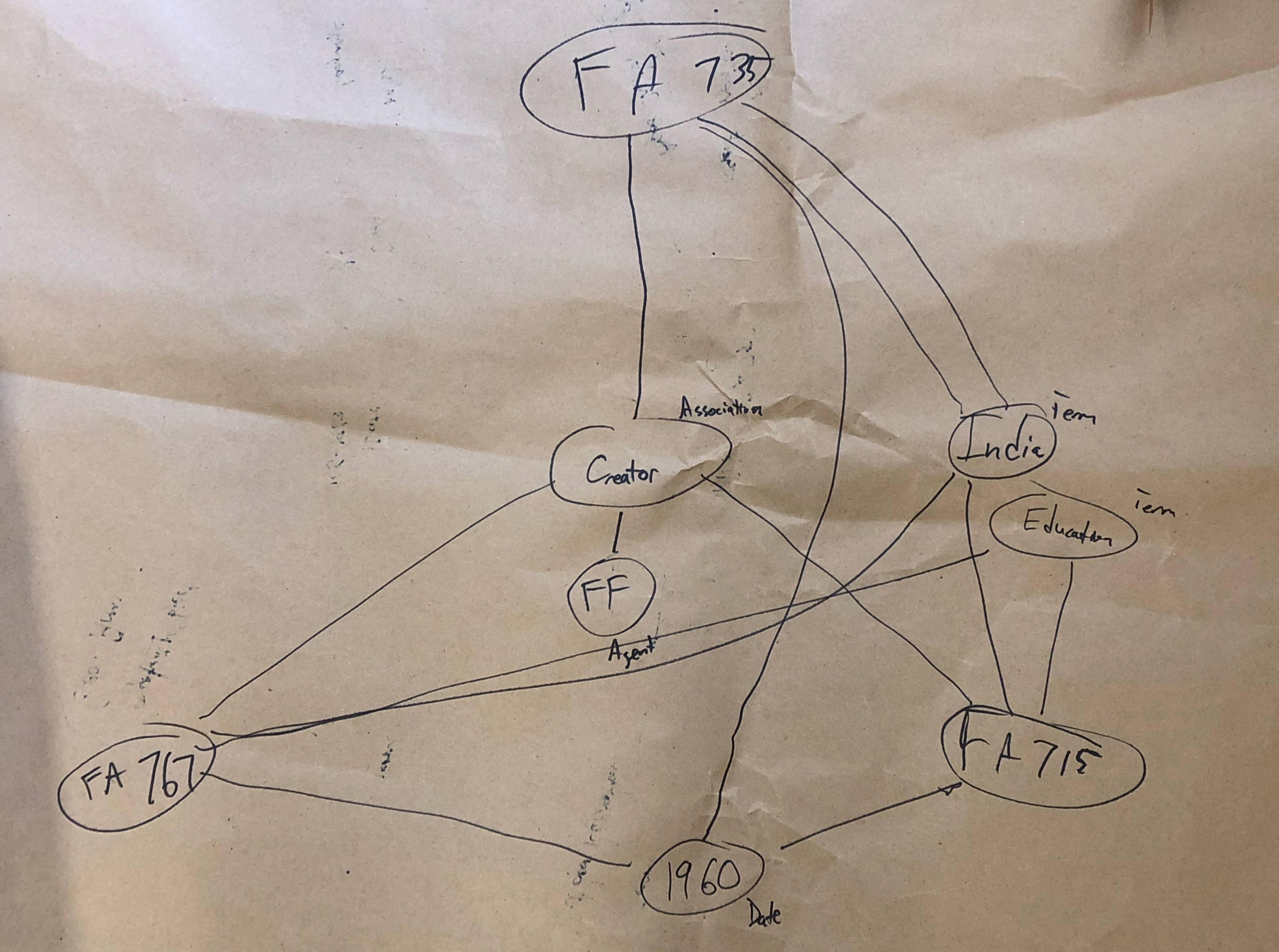
Secondly, we noticed a lot of groups trying to make relationships between different agents. We’re not positive about what our coworkers are trying to tell us, but the desire to show relationships between two different agents in regards to collections is interesting to us. In many cases in our collections, the person who created a record might be part of a family, or an employee of an organization, and it appears that our colleagues are saying that it might be important to be able to quickly see those types of relationships in a discovery environment. We saw a bit of the same behavior between dates, languages, and a couple of other objects, but the usage was most prevalent with agents. Our inference is that our testers were looking for different ways to show connections outside of the traditional relationships, and we’re not exactly sure how we’re going to use this information yet, as we just finished our debrief and review of the diagrams earlier this week, but we do think it’s an interesting occurrence that’s probably not a coincidence since it appeared across all three function areas.
Ultimately, none of the groups had any major changes for us except to find a few flaws in our relationship linkages and some minor spelling mistakes. They all were savvy and picked up that we excluded boxes and folders from our model. However, we designed this diagram primarily for born digital and digitized materials, so they weren’t really necessary for the time being. (Ask me about my campaign to remove boxes and folders as much as possible from researcher-facing archival description next time you see me and I’ll talk your ear off.) Thanks to all of the help and input from everyone involved, we ended up with the below draft that we’re going to use moving forward.
Next Steps
So where do we go from here? Well, the first step was documenting our process. It’s been a long journey to get to this point and we wanted to share our procedures out, which hopefully this blog post can do. Moving forward, our next step will be to start taking a look at how we want to serialize this information in RDF for Fedora. We’ll be leaning on the work of existing vocabularies like viaf, dcterms, foaf, pcdm, and more as much as possible. Additionally, we’ll be having in-depth discussions of how we want to map this data to other systems like ArchivesSpace, Archivematica, Aurora, and Fedora. The mapping discussion is probably going to be a huge project that takes a lot of conversations about how everything works in the microservice architecture that Hannah talks about in the linked blog post 1,500 words ago. We’re not exactly sure how everything is going to look at the end of the year, but we’re excited to be moving forward.
Thanks for sticking with us to the end of this one. We know it’s long and has a ton of information, but we thought it was important to get it all out there to the world. As always, don’t hesitate to reach out with questions or comments.