Over the past few months, I’ve been experimenting with our Collections API to explore its possibilities. Most recently, I’ve used it to create some visualizations which provide a visual avenue for exploration of collections, as well as that might not be possible simply from reading the description. Now that we have publicly launched the Collections API (along with some helpful documentation), I wanted to write about this project as an example of how the API provides some new ways of exploring the RAC’s collections.
Starting Out
At the outset of this project, I wrote some small Python scripts which pulled data from the RAC Collections API and then, using matplotlib and seaborn (which is built on matplotlib), generated visualizations.
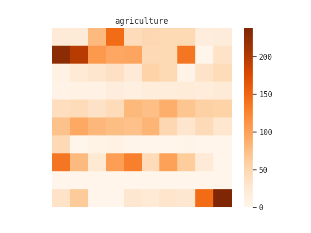
Initially, I focused on creating heatmaps which represented the location of search terms within a particular collection. These are a variation of sorts on the visualization we produce for the minimap feature in DIMES. For example, I knew that “agriculture” was a term that occurred throughout the Rockefeller Foundation records, so I generated a heatmap of that term’s occurrence using the minimap endpoint:
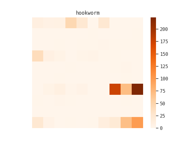
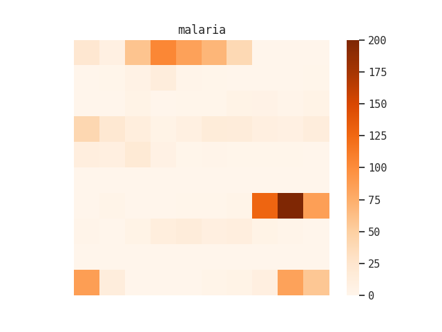
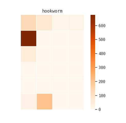
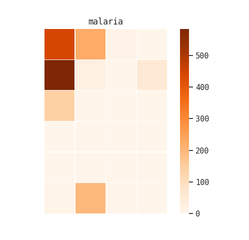
I also tried this with “hookworm” and “malaria”:
I tried a second version of this heatmap where I broke the collection up by record groups, and then made a heatmap of term occurrence within each of those large aggregations:
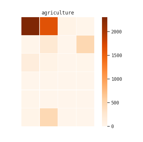
Although these visualizations were interesting, they didn’t give me a lot of new information that one of our reference archivists or an experienced researcher wouldn’t already know.
Refining Expectations
To broaden my horizons, I reached out to Rachel Wimpee, the Assistant Director for Research and Education. She helped me identify some additional research questions, largely focused on philanthropic strategy over time:
How does the number of grants made to individuals (for example fellowships and scholarships) compare to grants for organizations? Is there a moment when foundations shift from giving to individuals to giving to organizations?
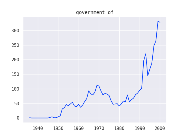
How does the number of grants to different kinds of organizations (for example educational institutions or governments) change over time?
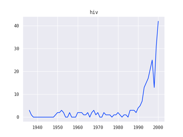
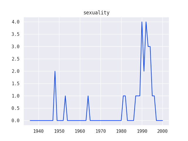
What trends in funding can we see by looking for grants on specific topics such as HIV or sexuality?
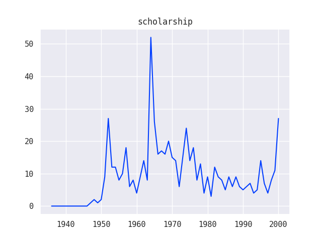
Since these questions involved the element of time, I created a second round of line graph visualizations using data from the Grants series of the Ford Foundation records:
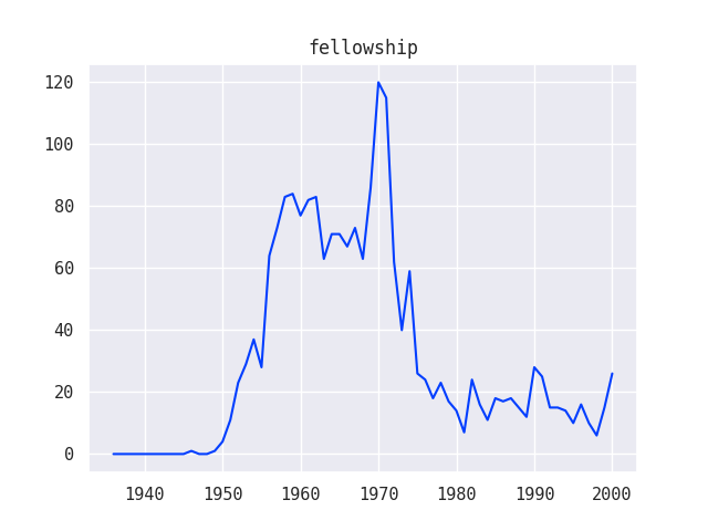
I was also able to combine multiple line graphs together to show how various trends relate to one another, for example, how different funding strategies used by the Ford Foundation compare over time:
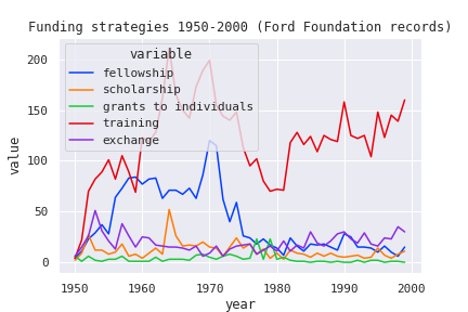
These visualizations helped to confirm (and in some cases complicate) existing narratives around the Ford Foundation’s philanthropic strategy. As you can see, there are some big spikes in the graphs that don’t totally make sense and might represent some data anomalies that would need to be investigated further.
After reviewing these new visualizations with Rachel, it became apparent that I needed to develop a solution that allowed non-coders to create their own visualizations on-demand. I ended up creating a Jupyter Notebook – a way of storing text along with executable code – which contained more generalized functions that allow a user to control what kind of visualization they want and the terms they want to search on. The hope is that this tool will serve as way of identifying potentially interesting stories which can then be further researched and published on RE:source. I published the notebook to MyBinder, so you can check it out and create your own visualizations. If you want to read more about how to use Jupyter Notebooks, the official documentation is a good place to start. You can also pull down the GitHub repository and run the notebook locally.
Lessons Learned
Working with our Collections API requires multiple kinds of expertise. I’m handy with Python and have some experience interacting with APIs, but don’t know that much about the RAC’s collections or research methodologies. Rachel has a deep understanding of the RAC’s collections and a great deal of experience researching and assisting researchers. In order to ask or answer interesting questions of the Collections API it was necessary to combine our knowledge and experiences. Doing that also enabled us to have realistic expectations of what these visualizations show or prove, and to understand where the underlying data comes from and what its flaws might be.
In 1989, Susan Leigh Star articulated the concept of “boundary objects,” or groups of information that are flexible enough to be interpreted differently by different groups, but strong enough to maintain their integrity as an object. Common examples include things like maps or specimens, which have many different interpretations depending on the users’ context but still have a name and an identity. Star argues that these boundary objects facilitate collaboration without consensus; they allow different social worlds to intersect without everyone involved needing to agree on everything.
The Digital Strategies team thinks a lot about how to make collaboration possible and effective. Boundary objects – in particular, UX methodologies and tools – have been key for us in working across differences in domains and mental models. I think that our Collections API is another example of this kind of boundary object which will help us collaborate across our staff and with our researchers. I’m excited to continue working with the API to explore and understand our collections!