We recently launched a new feature on DIMES – called a “minimap” – which allows users to jump directly to search matches within collections. This feature was conceptualized and implemented over the course of several months through the efforts of colleagues across the RAC and represents a bit of an unusual approach to a common design problem in archives, so it seemed worth writing about the process behind it in more detail.
Defining the Problem
Our redesigned DIMES interface intentionally favors context over speed in the discovery process. This means that users must “dig into” collections to find matches, starting at the top level and then following the trail of orange badges which indicate where a match is located. This works well when those matches are not in deeply nested collections or are not at the end of long lists of siblings.
As we saw during our initial rounds of user testing, both of those cases (which are common) result in a poor user experience. We observed users either express extreme frustration or abandon tasks altogether when looking for specific matches for their search terms in large and deeply nested collections, or when scrolling through a long list of siblings.
Other Solutions
In our previous version of DIMES users were able to search within collections. As noted in the blog post I wrote when this feature was implemented, it was always a compromise solution which introduced some new usability challenges while solving others. In the new iteration of DIMES, we felt this feature might do more harm than good by disrupting the conceptual design of the site and isolating hits from their context in the collection. A different approach was needed.
The solution to this problem was not immediately apparent. Initial ideas - which were largely based around providing lists of matches within collections - didn’t scale appropriately across the range of collection sizes and matches.
We quickly realized that we needed an approach that was centered more in visualizations and less in text. This was not something that was in our wheelhouse, so we decided to do some research to see how other people had solved this kind of design problem:
The New York Public Library’s Mini Map was one of the first things we referenced. To see this in action, visit the Timothy Leary Papers, then click on the lab flask in the document menu to toggle the Mini Map. This feature allows users to both quickly jump to a part of the finding aid document and gives them a sense of where they are in the document as a whole. An important thing to note is that, although the Mini Map reproduces the text of the page, in the context of the Mini Map that text is not legible but instead serves as a graphical navigation element. The Mini Map does not include an indication of search matches, but it was an important influence in our final solution, and also pushed us more firmly towards a graphics-based (rather than text-based) approach.
The VS Code text editor also has a similar minimap, which also incorporates matches for a keyword search. Note here that, in addition to reproducing the document in the minimap element, there is also a second bar which indicates, in large blocks of color, where the matches occur in the document.
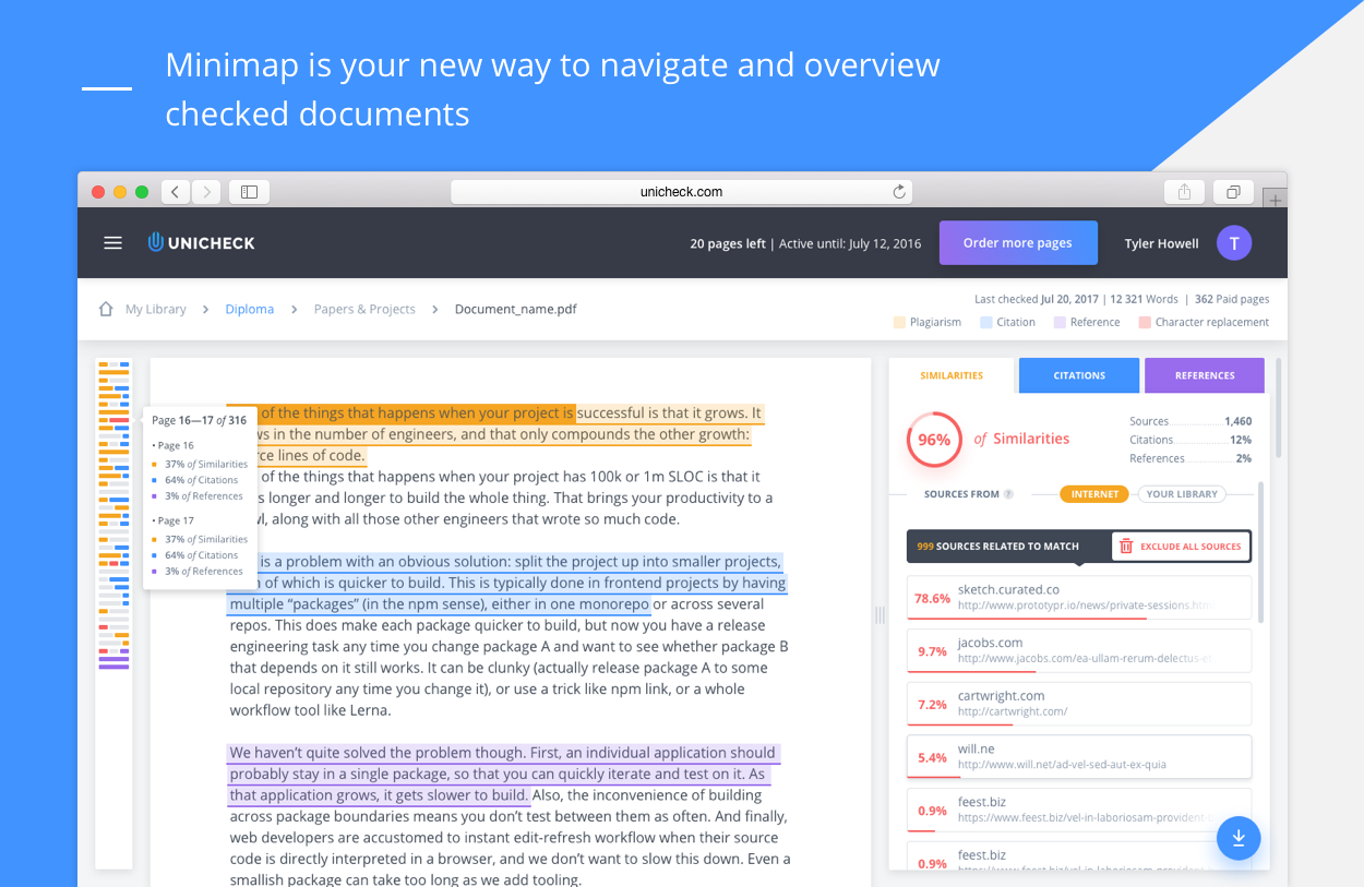
Unicheck (a plagiarism checking solution) also implemented a minimap in their dashboard. Here the document text has been completely replaced by a simplified graphical representation which indicates the presence of different kinds of matches.
We also looked at some other solutions like TileBars, a heatmap-like approach developed at the Xerox Research Center; [SeeSoft] visualizations(https://ieeexplore.ieee.org/document/177365), used in software development; and a Chromosome mapping tool.
Developing the Minimap
Using the examples above as a starting point, we collaborated with ondesign, the design firm that we worked with to create the original DIMES interface, to develop the visual appearance of the new feature, which we called a “minimap” as a nod to the other similar implementations described above. Early iterations of the design used colored bars to indicate the location of matches in a collection (similar to the VS Code minimap) but we pivoted to using squares because that gave us a greater number of potential click targets, thus increasing the granularity at which we could represent matches. We also initially placed the minimap in a hidden sidebar which slid into view when users clicked on a button, but over time we felt that if the new element helped users navigate collections, then we should always have it visible.
The development work for this new feature took quite some time, and involved changes throughout the fetch and transform stack as well as the RAC Collections API which powers DIMES:
Adding a field which represents a given object’s absolute position in a collection. Finding a performant method by which to calculate this piece of data was challenging, but ultimately we settled on using a query which searches for the presence of a URI within the ancestors array in ArchivesSpace.
We had to build out an additional API endpoint which returned the data necessary for create the jump to hit component. Once we had the absolute position data in place this was actually quite easy to do.
We then added the new minimap component in DIMES. A major concern for us was making sure that the new feature was as accessible as possible, which meant that we couldn’t simply rely on color and graphical elements to communicate information, but needed to ensure that users who employ assistive technologies like screen readers would be able to navigate using the minimap as well. We coded the minimap squares as links with descriptive link target text that could act as a kind of jump-to-hit navigation for all users, including blind or visually impaired users.
Last, because the minimap required that users be able to jump to an arbitrary point in a collection, we needed to develop an alternate loading strategy. Previously, DIMES would need to load all the objects above the requested object in the collection hierarchy. This often took a very long time. The new loading strategy loads the requested object and enough surrounding context to display on the page, and then loads either up or down as the user scrolls.
Testing
Because the minimap is an unusual pattern in archives, we wanted to make sure we tested it thoroughly before releasing. We conducted two rounds of user testing on the feature (led by Hannah and assisted, as always, by our awesome Usability Observers Team), guided by the following questions:
- Do users understand and start using the minimap feature to find matches?
- Can users quickly get to a deeply nested object using the minimap?
- Do users understand that more than one match can be contained in one minimap square?
- Can users locate digital content using the minimap?
- Are users able to browse the objects surrounding a match?
We quickly learned that the minimap was an incredibly useful feature and that, once users started using it, they were able to much more quickly get to matches for their searches, particularly in large and deeply nested collections. Since this was the main use case for the feature, we were pleased! However, we found that many users did not initially notice the minimap or, if they did, did not understand that it was something that they could interact with. We made a number of changes as a result:
- Tweaked the hover action of the active squares to invite user attention and clicks.
- The first time a user encounters the minimap, we highlight the feature and provide some brief description about what it is and does.
We will continue to monitor user adoption and ongoing use of this new feature through web analytics.
Conclusion
We’re pretty pleased with the minimap and think it’s a big step forward for DIMES. Implementing new and unusual features like this requires the engagement of many different kinds of expertise – visual thinking, data manipulation and user experience testing to name a few – which means that it requires collaboration across the organization as well as across domains.
We’d love to hear your feedback on this new feature! Drop us a line and let us know what you think.