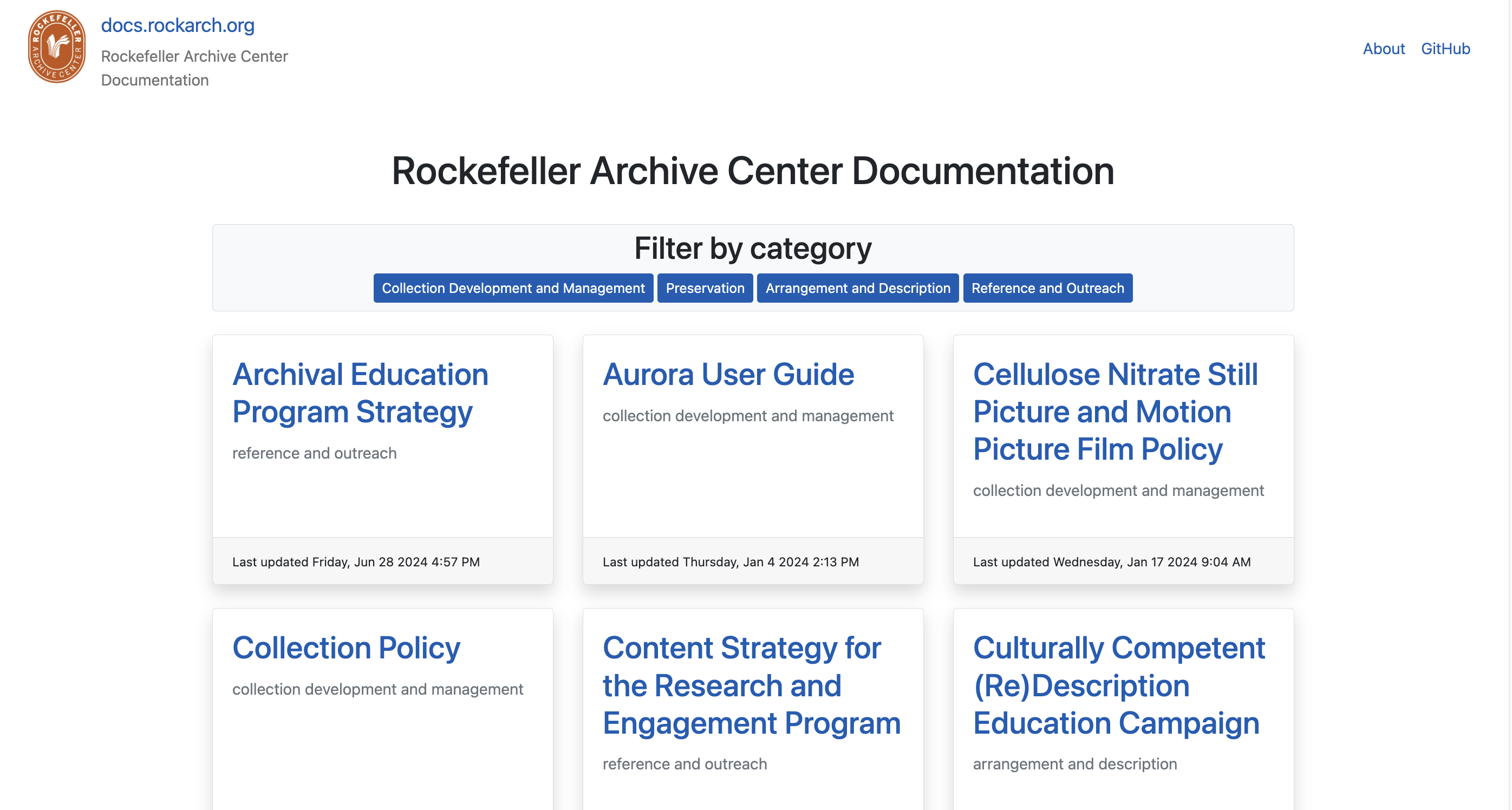
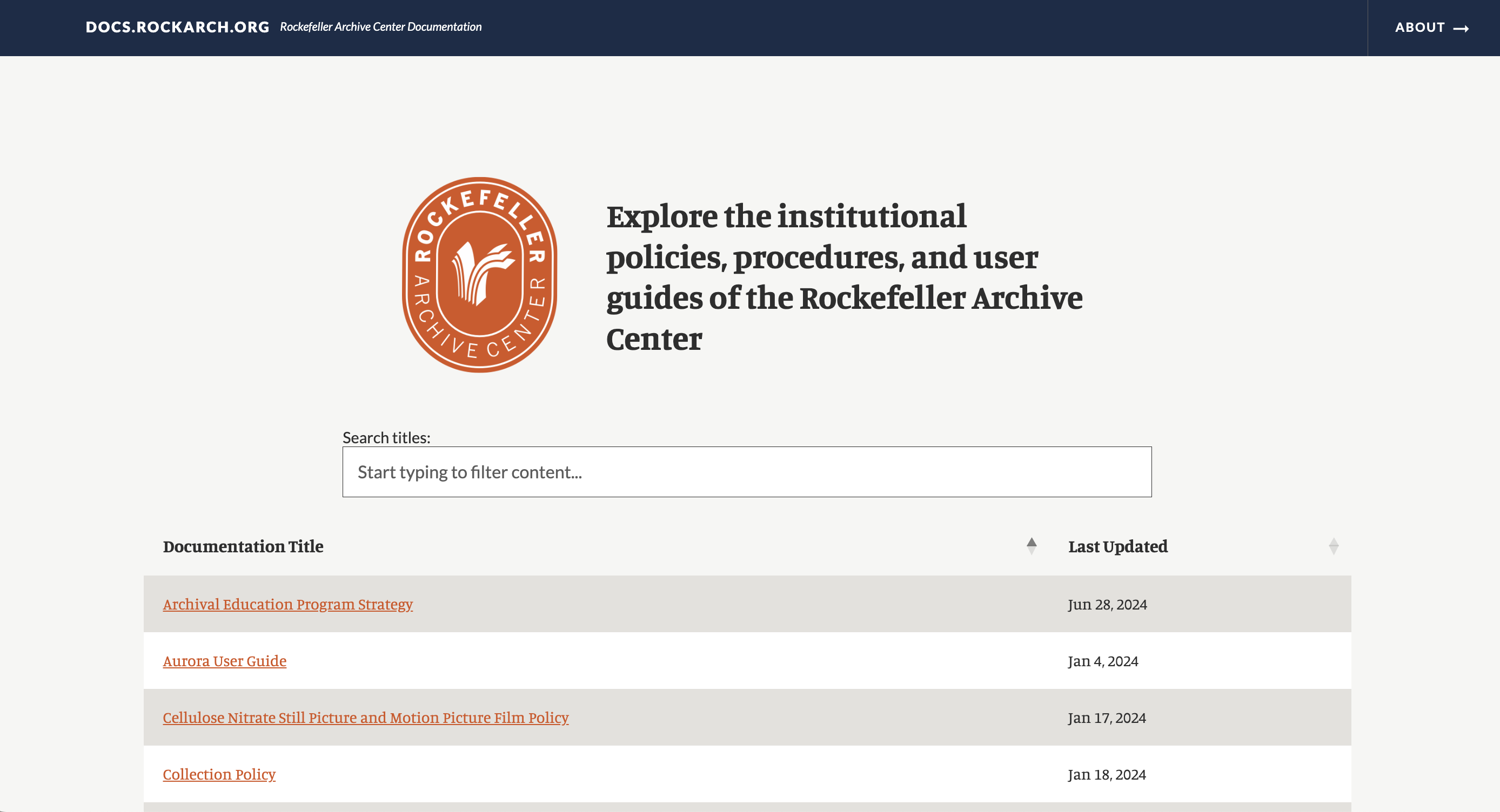
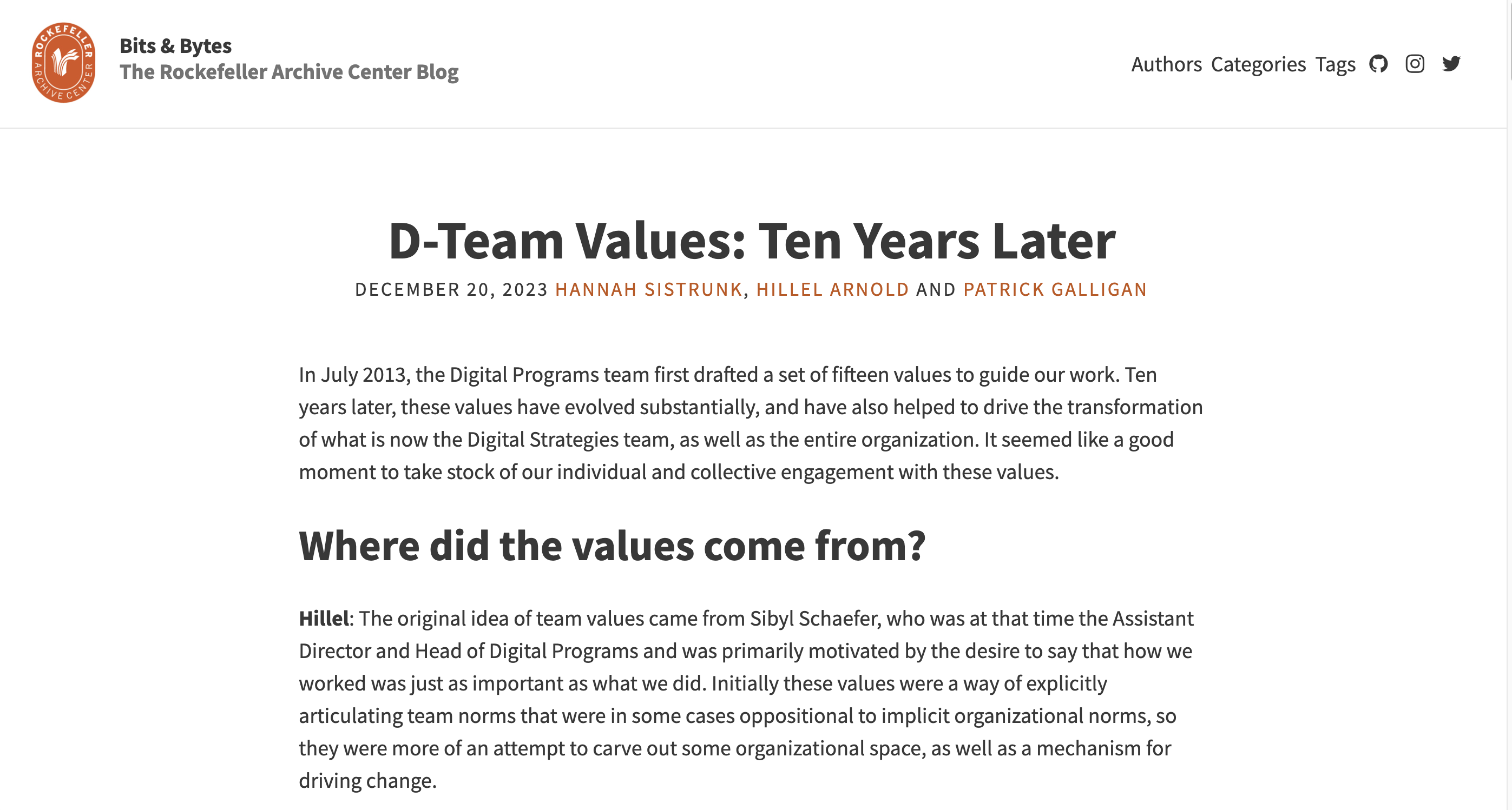
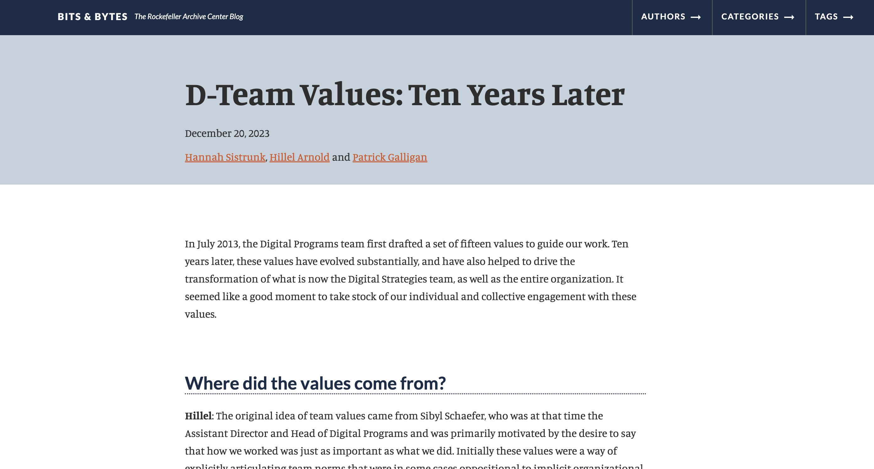
You may notice that this blog site looks a little different than it used to! We’ve been working to implement a component-based Style Guide and Style Library to unify the visual language of our websites and applications in a way that is maintainable, will improve future design processes, and is more accessible for users. As part of this effort, we’re excited to announce the launch of two newly redesigned sites: the Bits & Bytes blog where you are reading this post, and our Documentation Site where we share RAC policies and procedures. We’d like to share some behind-the-scenes reflection from the perspectives of project team members Hannah Sistrunk, Patrick Galligan, Darren Young, and Katie Martin on how we used this project as an opportunity to build web development and collaborative coding skills.
The Style Library Implementation Team and our Goals (Hannah)
When I first planned the work of building and implementing the Style Library and Storybook Style Guide, it was always a goal to use this project as a learning opportunity to build web development skills working with HMTL, CSS, and Sass not just on the Digital Strategies Team, but with collaborators from other teams in the organization. The Style Guide was built collaboratively by Digital Strategies (you can read more about the technical aspect of that work in a previous post,) with each member of the team helping to define and write component visual styles in Sass and document them using Storybook. That work resulted in a single RAC Style Library CSS file that we can now import via a CDN into each of our sites.
With that versioned CSS file ready to import, we undertook the work of replacing locally defined styles that were specific to each website and replacing them with the RAC CSS stylesheet. Custom styles are still necessary for site-specific features and layout, but we can vastly simplify site-specific CSS.
Implementing RAC Styles in Bits & Bytes and the Documentation Site
After an initial phase of testing and refining our Style Library by implementing it in internal RAC websites like Matchbox and aquila (our authoring tool for PREMIS rights statements), Digital Strategies expanded the project team to include Processing Archivists Darren Young and Katie Martin who we’ve collaborated with before on coding projects (see their work on DACSspace and the ArchivesSnake API Helpers Package). We paired up, with each pair working on a site together. The work was structured into three two-week “sprints” bookended by kickoff/retrospective meetings to share our progress, challenges, reflections, and agreeing on next steps and strategy.


How We Organized Our Work (Darren)
As Hannah mentioned, I have previously worked with Digitial Strategies on coding projects, and through the two projects she highlighted, I have become experienced at pair programming, an approach where two programmers work on the same code at the same time. Pair programming provides rich opportunities for learning and confidence building. The communication it requires supports knowledge building both by listening and teaching. I had not done website development since the creation of the Documentation Site and looked forward to the familiar model of pair programming to resurface knowledge and develop new skills.
Development Environment
Building and running the Blog site locally provided an unexpected challenge for me in my first meeting with my partner Patrick. We started our meeting with Patrick walking through how to build the site locally which was useful to me because I had never done it for the Blog. When attempting to build the site myself, I realized I didn’t have Jekyll or Ruby installed on my machine which was necessary for generating the site.
In addition to letting us view and test our work on the site, the development environment also helped our collaboration. We could look at the site visually in a browser when meeting together and view each other’s work when we worked independently.
One Branch and One Pull Request
Unlike with most of the other coding projects I have worked on, we used one GitHub branch throughout the entire project and opened one pull request which we left open as we moved through the different sprints. I appreciated this approach because the expectation of our work evolved as we implemented the Style Library. Having one pull request maintained a central record of all of our commits as well as the summaries we wrote for each sprint detailing the work that was accomplished to facilitate review by the rest of the project team.
Making Design Decisions with Wider Impact
Patrick and I started out work by tackling discrete components like implementing the header and footer from the Style Library. While we continued to have assigned tasks through the different sprints, our work became less easily segregated as we confronted larger issues that impacted the site globally like typography and spacing. These were issues we had to consider not only in how we wanted them to look on the Blog but also in supporting consistency across all of the RAC websites which is the objective of the Style Library.
At times, this balance made me feel uncertain in my individual work, but the communication supported by the retrospective meetings helped align the project team and clarify our strategy. I think working off one GitHub branch was useful in this situation too, because Hannah was able to easily jump into the branch and make code edits to help us out with her expertise as the Style Library project lead.
Tools and Resources for Learning and Working with HTML/CSS (Patrick)
Getting Oriented to Front-End Development
I’ve helped build the RAC data model, I can navigate database queries through the command line, and I’ve been known to write a Python script or two, but frontend UI updates had me feeling like it was my first day on the job again (because it kind of was). I had dabbled in front-end elements for the RAC Library site and the original blog site, but most of that was building off other open-source frameworks, and it was mostly surface-level changes without thinking about designing the site for usability or clarity. I hadn’t learned about or touched UI elements in a meaningful way since graduate school. As such, there were quite a few things I found both challenging and interesting about the work.
From a process standpoint, I, personally, found that designing and tweaking UI elements was much closer to troubleshooting code than it was to writing new code from scratch. I found myself making very small changes, checking to see what changed on my local deployment of the website, and then going back to the code to tweak it some more based on what I saw. To me, this felt like a similar process to updating code, reading logs or API responses to see what changes after testing, and then going back to the code to make even more updates. It was a surprisingly iterative process, when I expected it to be more of a “set it and forget it” one. I had to wrap my head around the process and change the way I work to be more in line with a trial-and-error approach.
Challenges and Helpful Resources
The first significant hurdle was familiarizing myself with my browser’s (Chrome) developer tools. I’m much more experienced debugging backend systems and reading logs than I am in figuring out what is controlling certain aspects of the frontend UI, so I didn’t have a lot of experience inspecting page elements to find out what CSS element is making something look the way it does. I did some reading and found a great basic tutorial for DevTools that I would recommend for anyone starting with this work. Understanding how to work with the DevTools was critical in helping me complete the project. There was a lot of trial and error as well, but I found it really interesting to learn about all the ways DevTools can help you with designing a site.
I also found the differences between element or object inheritance rules between Python (the coding language I’m most familiar with) and CSS were initially hard to grasp. Inheritance in Python is quite different from inheritance in CSS. CSS allows for cascading of rules, which means that different style sheets can influence a single element. For example, your paragraph styles can be both influenced by an external stylesheet like the RAC style library, as well as your own custom styles that you define locally. This is a major difference between most backend development work, where you usually define the rules for something and that’s how it is. You may have multiple places you can define rules, but usually one of those rules takes priority over the other. I had to do a lot of reading about CSS inheritance before I really grasped what was happening, and I found the Mozilla documentation particularly helpful.
Another challenging new concept to me was the different ways that you could change the layout of a page. Understanding the differences between Flexbox and Grid felt like understanding two different languages when I first started out (and still kind of does). However, CSS-Tricks has great introductions to Flexbox and Grid that really helped me understand the differences between the two and how they can work together or separately. As great as these tools are, I still struggle with knowing when to use each of them, and I feel like I’ve just scratched the surface of their potential, however, I think that is a skill that comes with time and practice. The CSS-Tricks website became my go-to reference for most CSS questions I had over the project.
Working with the RAC Style Library
I found working with the RAC style library possibly the easiest part of the whole project. Hannah laid the Storybook Style Guide website out in a way that made it extremely intuitive to grab some code and implement it into one of the sites. I knew exactly where to put certain CSS elements on each project site, and I could immediately see changes on the sites I was working on; it was exciting to feel like simple changes that I pulled from the Style Library had a profound influence on the appearance of our sites. It was abundantly clear that a well-made style library would have profound impact on future site designs by making it incredibly easy to create sites that have a unified appearance. Re-learning to work with CSS was not without its challenges, but the Style Library made it much easier. I’m excited for future work!
Learning New Things and Polishing Rusty Skills (Katie)
As a processing archivist, I am no stranger to finishing a project and then jumping back in years later to improve description or update a guide as more material comes in. Each time, it is a reminder that it is difficult to put yourself into the headspace when you worked on a project. As Patrick mentioned earlier, updating the RAC Documentation Site to implement the RAC Style Guide felt much like this. I have not actively worked on the docs site since 2019, and it was a little daunting to come back to it after so much time had passed. I have not used my (very basic) CSS or HTML skills in the time since.
The first thing I was thankful for was the way Hannah structured our meetings. Hannah was the best resource during this process. At the beginning of each sprint, we met one-on-one to divide the work. In these meetings, Hannah would share helpful tips and share her screen while addressing one of the tasks we planned to complete that week, like implementing the header or fixing margins. We had mid-sprint meetings to go over the completed work and Hannah could answer my questions.
I relied on the detailed documentation provided in the Style Guide and the docs-build README. I was surprised by how much I remembered from working with CSS previously, but I also consulted the resources Hannah provided prior to starting the project many times. I think it took actually digging in and playing around with the site code, looking at how changes appeared on the site, and using the developer tools in Chrome to grasp the concepts I was reading about.
This project was also a great refresher on using GitHub as a project management tool throughout the sprints and using Visual Studio Code to make commits, merge conflicts, and run the terminal to build the documentation site locally.
As we started this project, Hannah emphasized that the main goal was to learn and build knowledge. I am always a little nervous to jump back into collaborative coding projects. Every time I am reminded of how much I do not know, and it can feel intimidating to admit that in a group setting. This project was a great way to learn in a relaxed setting and refresh my skills while also learning new approaches to collaboration and coding.