This past summer, we ran a series of usability tests in order to gather and distill feedback from our coworkers about a redesigned interface we developed for the Rockefeller Archive Center’s Documentation Website. This blog entry continues a discussion I started in a previous post about our motivations, approach, and processes for redesigning the site in order to enhance user discovery and access. I will explain how we planned and carried out the usability tests in order to effectively evaluate the changes we have made to the platform, and I will reflect on my experience with conducting usability testing for the first time. By describing the fixes we have proposed in response to the issues identified during usability testing, I hope to create a picture of how the Documentation Site will appear when we finish development!
Sitting in to Observe
Katie Martin and I worked as a pair of observers for the four usability tests our team conducted this summer. While Hannah Sistrunk facilitated the tests in person, we watched remotely. Utilizing the Morae usability testing software, Hannah was able to broadcast the on-screen activity of test participants as well as video and audio of their responses and thoughts. Katie and I then observed the participants as they navigated through the site and listened as they talked through their processes, ideas, and reactions. In the observer role, we allowed Hannah to focus on running the tests and supporting our participants. Katie and I could then catch any details of our participants’ activity or conversation that might have been missed.
The usability tests we conducted for the Docs Site gave Katie and me our first chance to step into the role of usability test observer. From the outset of our efforts to redesign the Docs Site, our team strove to include usability testing as part of our development, and Hannah generously shared her knowledge on the subject with Katie and me by sharing the writings of web usability expert Steve Krug as well as the work she has done for the usability testing of Aurora. Hannah is an enthusiastic advocate for usability testing at the RAC, and she has provided thoughtful and informed leadership throughout this phase of our redesign project.
We ran our first usability test as a pilot test so that Hannah could practice administering the user tasks, and Katie and I could practice observing the participant’s activity and noting the places on the site where the user experienced difficulty.
Going into the usability tests as an observer, I thought that by viewing a user’s progress on the site remotely, I would feel more detached from the successes and failures of the platform’s design than if a user were to give me feedback about the site face-to-face. I was surprised to find myself so heavily invested in how our test participants moved through the site. Watching participants scroll down and up the homepage as they tried to locate a piece of documentation made me anxious because I worried that we had not effectively provided opportunities for our users to refine content on the site like we had intended. There were other times when I felt relief and even a small amount of pride, such as when a participant commented that she liked the look of the homepage.
Most importantly, through observing and listening to our participants, I learned which components of the site I had overlooked when considering the usability of the platform. When we coded the filter buttons at the top of the homepage, I mostly focused on correctly writing the JavaScript so that the buttons would refine the documentation items. I hoped that if I succeeded, the added filtering functionality would improve user experience on the platform. I did not consider that these buttons may prove to be unhelpful, not because their functionality did not work, but rather because their function was not obvious. By watching how our test participants tried to perform the tasks, I could see that multiple users did not immediately understand the purpose of the filter buttons.
Testing What Can Be Done
The use of the filter buttons as a way to discover content on the homepage was an element of the Docs Site redesign we specifically wanted to assess through the usability tests. The group of tasks that Hannah created for our participants to perform emerged in direct response to the objectives we wanted to achieve through revamping the site as well as our original goals for launching the platform. Katie created the table provided below for a Documentation Site Usability Testing Report that she shared with our staff earlier this month. It summarizes the user tasks we assigned to our participants.
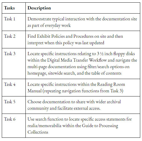
Task 3 offers an example of how we sought to evaluate the changes we made to the platform. The filter buttons, homepage search box, and documentation page search box were all features we added to enhance discovery and access following the expansion of content on the site. By giving our participants this task, we wanted to gather data on whether or not users found these functions helpful.
As previously mentioned, we also wanted to evaluate how well the site fulfilled our original goals for storing and disseminating our institution’s documentation on a central web platform. Some of these goals included the implementation of tighter version control over our documentation, the ability to share our documentation with archivists outside of our institution, and the capacity to limit access to documentation that needs to remain internal. Task 2 tested how the “last date updated” information we include on the documentation cards assists users trying to confirm they are accessing the most up-to-date content. This element was a part of our original design for the homepage. During our redesign project, we simply tried to emphasize the information by deleting unnecessary content from the documentation cards.
The pilot test we conducted to gain experience in our different testing roles also provided us with an opportunity to test how well the various tasks targeted the components of the site we wanted to evaluate. For instance, we made a change to Task 5 after the pilot test because it did not effectively test whether or not users could discern if a piece of documentation was only available internally. It originally asked share with a colleague at an outside institution, none of which were actually designated as strictly internal. As a result, we changed the task to refer to reference services documentation.
Capturing User Perspectives from Across Our Institution
We knew that more than well crafted user tasks were required to successfully run a round of usability tests on the Docs Site. We also needed to ensure that the data we collected from the tests represented the diverse backgrounds and viewpoints of our staff members who makeup our primary user audience. Therefore, we recruited our four usability test participants from three different program areas at the RAC: Collections Management, Processing, and Research and Education. We also considered our colleagues’ varying levels of use and experience with the Docs Site when selecting the individuals we asked to volunteer.
We want to extend our sincerest thanks to our four usability test participants for the generosity they demonstrated in giving us their time as well as their commitment to actively trying to work through the different tasks. When observing the tests, I was especially impressed by the participants’ honesty and clarity in expressing their thoughts about the site. We asked our participants to put themselves in the vulnerable position of having a team of people watch them while they tried to complete a set of assigned tasks, and they performed superbly.
Prioritizing What to Fix
We conducted four usability tests that lasted about 45 minutes each. Immediately following every test, our team would convene in order to discuss the issues we had noticed. We used these meetings to articulate what parts of the site’s design were causing the participants to experience difficulty and to identify the most significant barriers to the usability of the platform.
Utilizing an Asana template, we documented the problems the test participants encountered and then grouped those problems based on whether or not we thought the issue was something we should fix immediately or something we should further test. We discarded some of these issues as we proceeded through the different tests because we would collect little data to support their urgency. There were instances where an issue expressed by one participant was not experienced by any of the others.
Talking amongst ourselves about the different user issues we observed helped us pinpoint what areas of the platform we could and should fix in order to improve usability. For example, we determined that some of the participants preferred or instinctively chose to scroll and browse for content they wanted. This was not an issue for which we could take action to correct. In fact, we realized that we had actually succeeded in facilitating improved browsing by alphabetizing the documentation on the homepage. During one of the tests, a participant shared that she found the alphabetical organization of the documentation helpful.
Nevertheless, we decided that we could fix the issues surrounding the confusing appearance and functionality of the filter buttons by implementing a number of changes. We have proposed adding text to say “Filtered by” next to the buttons in order to clarify their purposes and changing the text of the “All” button to more accurately reflect its function of clearing the filters.
The Documentation Site Usability Testing Report lists the issues that our team observed during the tests and describes the fixes we propose to resolve them.
The Site You Will Soon See
Our team is now transferring the issues Katie described in her report to our Docs Site GitHub repository as part of our regular processes for developing the platform. We will use those issues to assign work amongst ourselves and document our progress on resolving them. In addition to the fixes described above for clarifying the category filter buttons, we also identified the addition of a link to the central RAC website as an easy solution for improving the Docs Site. One of our test participants stated that she would expect to find such a link at the top of the site or in the About page.
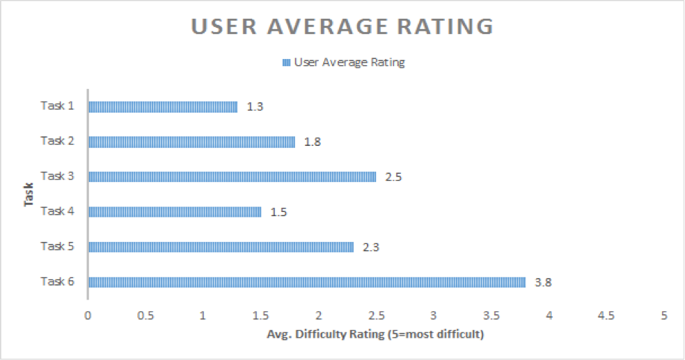
Some of the other fixes we have proposed will prove more difficult to strategize and implement. The data we collected from the tests shows that participants experienced the most difficulty when trying to perform tasks which required them to navigate multipage documentation and utilize the search function on the individual documentation item pages. Those tasks received the highest average difficulty scores out of the six we had our participants perform. The table provided below describes the average difficult score each user task received. Katie prepared it for the Docs Site Usability Testing Report.
I was surprised to learn that the multipage structure of the more extensive documentation items could prove confusing because it is one of the original design elements of the platform. Prior to the tests, I had only ever thought of it as a means to provide faster browsing for large pieces of documentation, but after hearing a participant say “When I come here, I think this is the whole document”, I can now understand how the current appearance of the table of contents does now effectively convey when a user is on a multipage document. We were happy to see all of the participants use the documentation items’ table of contents to find information, but we also observed that participants had difficulty finding where they were in the documentation after clicking on a subheading because the table of contents offered no visual cue to show where they had landed. The subheadings did not highlight to show that they had been used.
In regards to the keyword search on the documentation pages, all participants wondered why the search retrieved results from the entire site rather than just the relevant documentation item. “I would expect it to be for the document only,” said one participant. Some of our participants expected that the search box on the homepage would be the one to facilitate a site wide search. Instead, that feature provides additional filtering functionality. We have proposed eliminating that search box in order to better convey the purpose of the category filter buttons.
Our current strategy for resolving multipage documentation navigation is to improve the table of contents on the documentation pages so that users can immediately recognize that an item is multipage and can utilize highlighted subheadings to track how they navigate through the document. We believe that an improved table of contents will also solve the issue with the documentation search box. Our data shows that the search feature’s function does not match users’ expectations. Participants wanted to search individual documentation, and we believe that by providing an enhanced table of contents, we will help users navigate and browse through a documentation item to find the content they want. Users can use Control F if they wish to conduct a keyword search of a document. We can therefore delete the search box.
In summary, the Docs Site that we will soon release to the public will be the redesigned platform described in my previous blog post with a set of four key improvements that we identified after analyzing the data acquired through usability testing. These improvements are:
- Providing a link to the main RAC website
- Clarifying the category filter buttons
- Improving the table of contents to clearly indicate documentation is multipage and to make subheadings highlight
- Eliminating confusing search functionality
Thank you again to our four usability test participants! Your reactions, comments, clicks, and scrolling helped us learn what components of the site’s structure and functionality we could fix in order to make the platform more usable for our fellow staff members. We are excited to implement those fixes and prepare the new Documentation Site for public launch!