I’m excited to share that we’ve finished implementing our open-source RAC Style Library, integrating its styles across our websites and refactoring our applications to align with the web components documented in our Storybook Style Guide. This project has already had a major impact on our ability to quickly, collaboratively, and sustainably develop and maintain user interfaces (UIs) that are accessible and facilitate better user experience (UX) by unifying our visual and experiential design across RAC websites.
In this final post about the project, I’d like to reflect on what we’ve learned and made possible with this work.
What we did
I won’t go into too much detail about the technical aspects and tools of this project, because we’ve covered those comprehensively in previous posts: Building a Website Style Guide and Sass Style Library and Redesigning Bits & Bytes and our Documentation Site using the RAC Style Library. But at a high level, we:
-
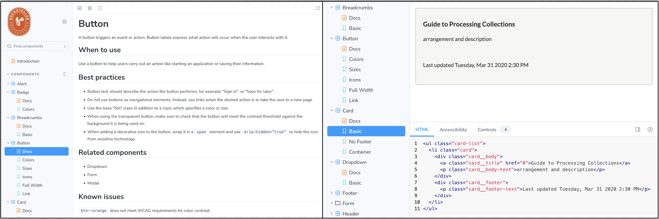
Used Storybook to define web component code and supporting layout and typography styles that we can reuse across applications. This resulted in standardized fonts and typography styles, a defined color pallet, and 25 unique atomic web components (e.g. button, form input, table) with variations for factors like color and size.
-
Documented best practices for web component implementation in our Storybook Style Guide.
-
Defined/compiled visual styles for the components into a single CSS stylesheet that can be imported into all our existing and future interfaces.
-
Publicly shared all resulting code in an open-source GitHub repository.
-
Worked collaboratively within the Digital Strategies Team and with colleagues from the RAC Processing Team with varying levels of web development experience to implement the newly defined components and styles into all RAC applications that we maintain. This resulted in substantial updates and improvements to 11 applications.
-
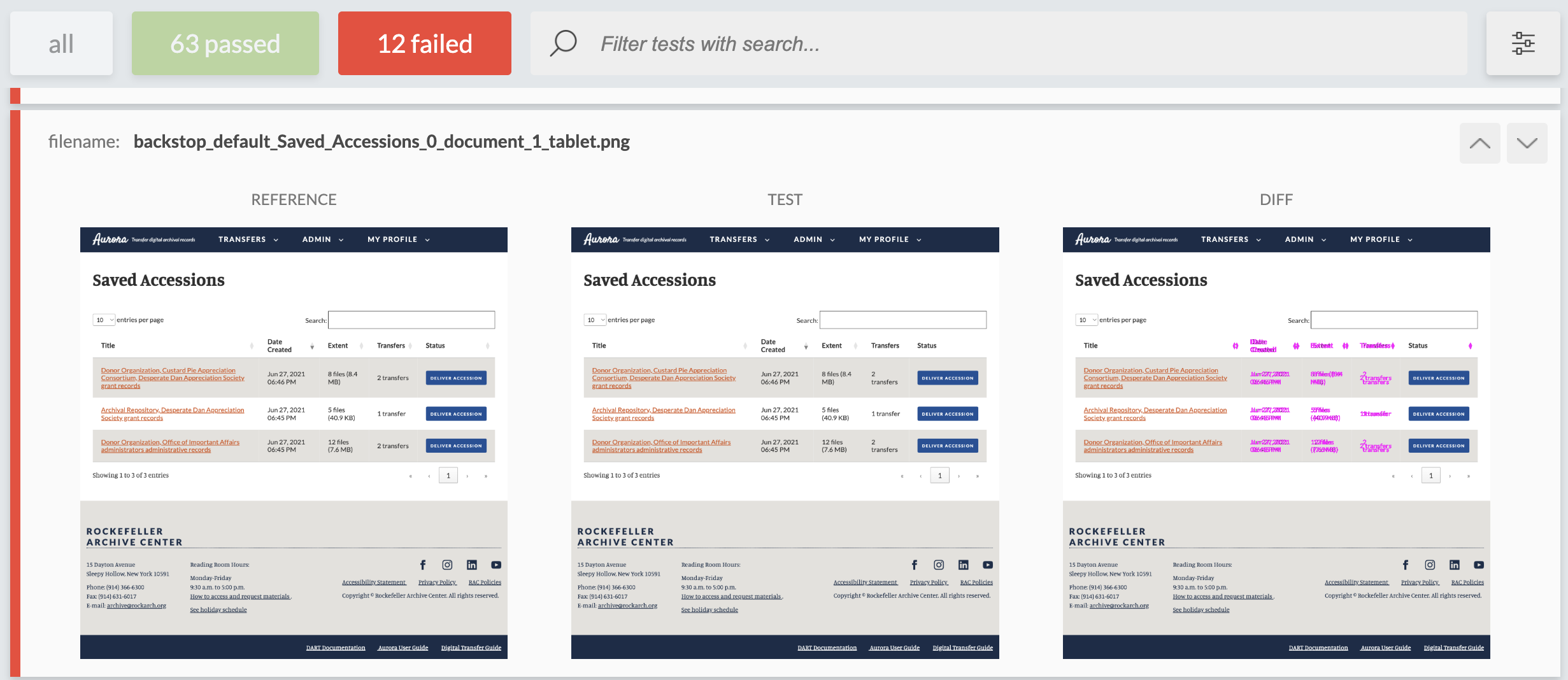
Implemented BackstopJS for visual regression testing in each application to ensure that future stylesheet updates don’t have unintended consequences in specific user interfaces, since the styles are maintained globally and imported locally.
What we made possible
Very fast and collaborative UI design and development
Now that we have created these website component building blocks and defined best practices for using them, designing and developing new sites and tools is exponentially faster. I recently created wireframes for a new tool to track and troubleshoot errors for packages as they move through our digital ingest microservices. Before the Style Guide, this would have been a more challenging task starting with a blank canvas. With the building blocks now defined and designed, I could focus on things like information architecture and interaction design right away.
I was also able to create high fidelity wireframes (not just basic sketches) fairly quickly, which I’d argue is a very effective tool when bringing stakeholders in to review the planned function and vision of a design. The site is in development now, and I’m seeing how much time it saves to be able to copy code directly from the Style Guide and quickly import a stylesheet to build the UI with the confidence of knowing that the code has already been reviewed, vetted, and documented.
Ability to build on previous UX research
Over the years, we’ve built a UX practice at the RAC where usability testing has been operationalized such that we test every new UI or major new feature we build. We’ve completed iterative rounds of moderated usability testing on most of our websites/tools, and we’ve conducted many other user research studies and participatory design activities that have helped us understand our users’ expectations and needs.
With all this accumulated UX knowledge, when we built the Style Library and Guide, we were codifying components that had already been tested. Recognizing that an isolated web component, removed from its context, doesn’t provide a good UX (and that usability studies do not test isolated components of a UI), we now have examples and information about how these components have worked together (or not) to inform our future interaction design best practices for implementation.
We will continue to research and test UIs as we design and build them, but now we’re starting from a much more informed place.
What we learned
For the team of 7 who contributed to this work, starting from different levels and domains of knowledge, this was an incredible learning opportunity. I’d like to highlight a few takeaways that may be useful for others to consider in their own contexts.
Frontend redesign is an opportunity to improve backend code
Beyond just importing a new CSS file and updating some HTML, implementing the Style Library in each application was a chance to take a fresh look at these sites. Many apps had been built years ago, and while we regularly update code dependencies and conduct other key maintenance tasks, giving ourselves time for a more comprehensive review was a game-changer. This work went beyond refreshing UIs, allowing us to also reduce technical debt, surface and address multiple bugs, improve code documentation, update 3rd party libraries to improve performance, and most importantly: gain a deeper technical understanding across the team about our applications as people updated code that they did not write.
Visual changes open the door for new UX research opportunities and user engagement
I recently implemented our Style Library in Aurora, a Django web application we launched in 2018 to receive, virus check, and validate transfers of digital archival records that also allows archivists to appraise and accession those records. It’s an essential tool for us that is used by our donor/depositor organizations and my Collections Management (CM) Team colleagues. Because the updates resulted in some substantial changes, I conducted some usability testing of the redesigned app with members of the CM team and scheduled a demo for the full team to learn about and offer feedback on Aurora’s refreshed look and functionality.
When you move the furniture around in your living room, you might realize that your lamp is actually quite ugly, and that you would actually love to hang some art between the door and the window. This same phenomenon occurs with visual updates for websites. We’ve updated Aurora over the years to add features and adjust functionality, but this was a major visual change, and therefore a chance for a fresh look and review of what we need and want from the app. In the usability tests and demo, the CM team identified useful features and suggested changes that are now on our roadmap to research and implement.
Visual regression testing can be a useful tool
As the styles implementation work progressed, we continued to make improvements to the Library and Guide, iteratively updating all sites with any new changes. A useful process to facilitate this was “visual regression testing”. As I noted above, we added BackstopJS to our apps as a local development testing tool (we didn’t add it to our automated testing pipeline because there were too many failed tests that needed to be assessed and often overridden based on human judgement). It functions by taking snapshot reference images of specified site pages/UI elements, and then when the UI is updated it compares current snapshots with the existing reference images. BackstopJS will highlight any differences for review. In this way, if we make changes to the Style Library globally, we can ensure that it won’t do something to the styles locally that was not intended. This has been particularly useful as we refine the Style Library, although it may become less useful as the styles are more fixed long-term.
Standardizing and documenting web components helps “shift left” with accessibility
Finally, this project marks a significant advancement in “shifting left” our digital accessibility practice. Shifting left in software testing refers to the practice of testing for potential issues earlier in the software development sequence, making them easier to resolve. This approach is frequently discussed among digital accessibility practitioners who often work in contexts where they’re educating and advocating for digital accessibility that is not yet prioritized. When accessibility is as an afterthought, it becomes much more difficult to address, and many issues can remain unresolved.
With the Style Library and Guide, we prioritized accessibility as an essential requirement, targeting the WCAG 2.2 AA standard. We added the Storybook Accessibility Addon to the Guide, which uses axe-core to run automated tests on each component and report results in Storybook. We also include accessibility considerations in component documentation, and incorporate best practices in the component code itself that draw from existing style guides that prioritize accessibility like A11y Style Guide and the GOV.UK Design System
However, we also understand that context and interaction design are essential factors in how accessible a site is, and we’re gearing up for a comprehensive accessibility audit project soon. We expect to continue to make accessibility improvements to the Style Guide and to our websites based on that audit and continued iterative improvements.
Final thoughts
Fundamentally, this work has been about supporting sustainability and intentionality in our design and development processes, embracing continues and iterative improvement that allows us to build on existing knowledge. It also supports the distribution of that knowledge across our organization, giving us new ways to include and engage colleagues in UI design and development. It’s a valuable reminder that standardization and documentation create new opportunities for creativity and engagement.